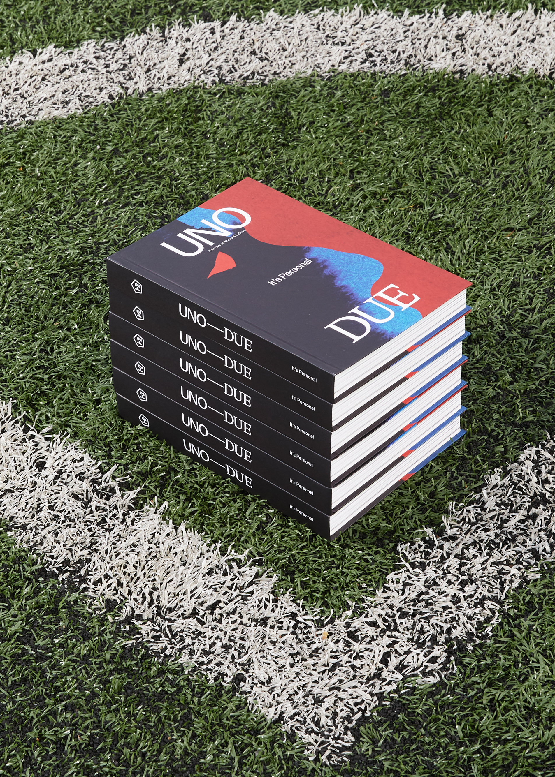
UNO—DUE Magazine
Vol. 3
Brief
Uno–Due is a yearly publication on football and culture. Football (Soccer) is an essential element of world culture, a sport that moves millions of people daily. Using the Beautiful Game as a springboard, Uno-Due delves into its reverberations on society and culture through human stories that go beyond the field, but are always connected to it.
Solution
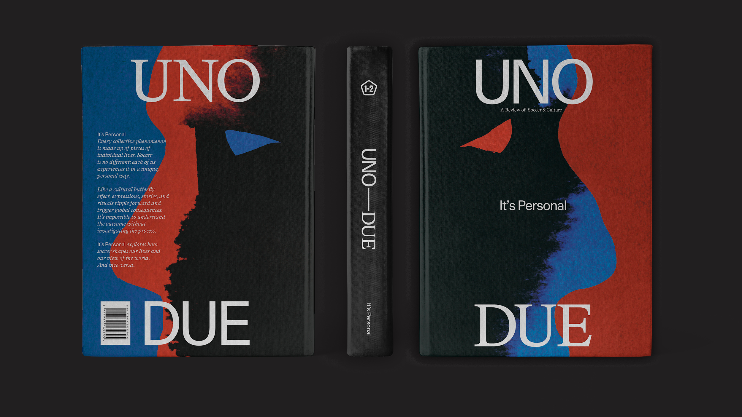
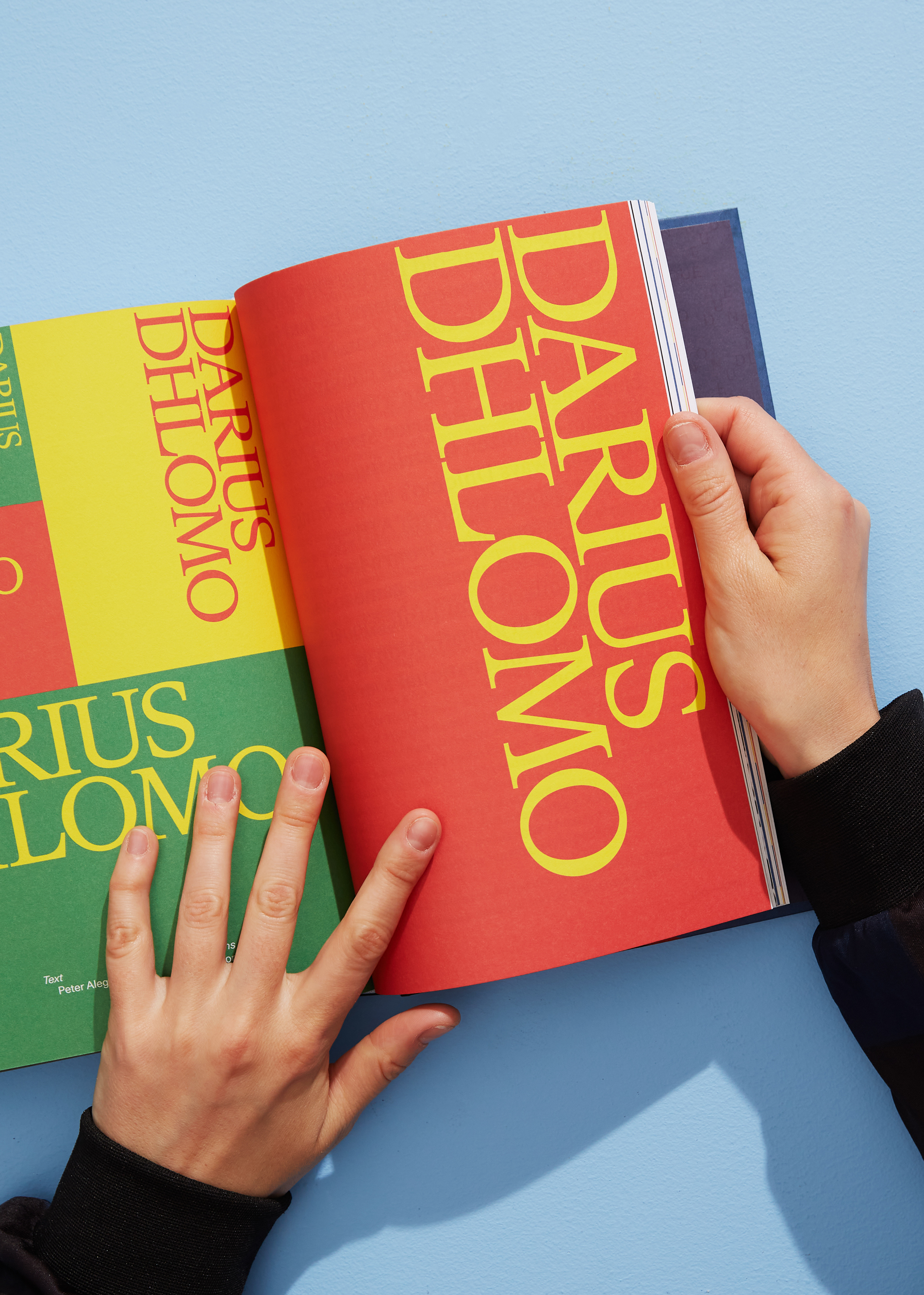
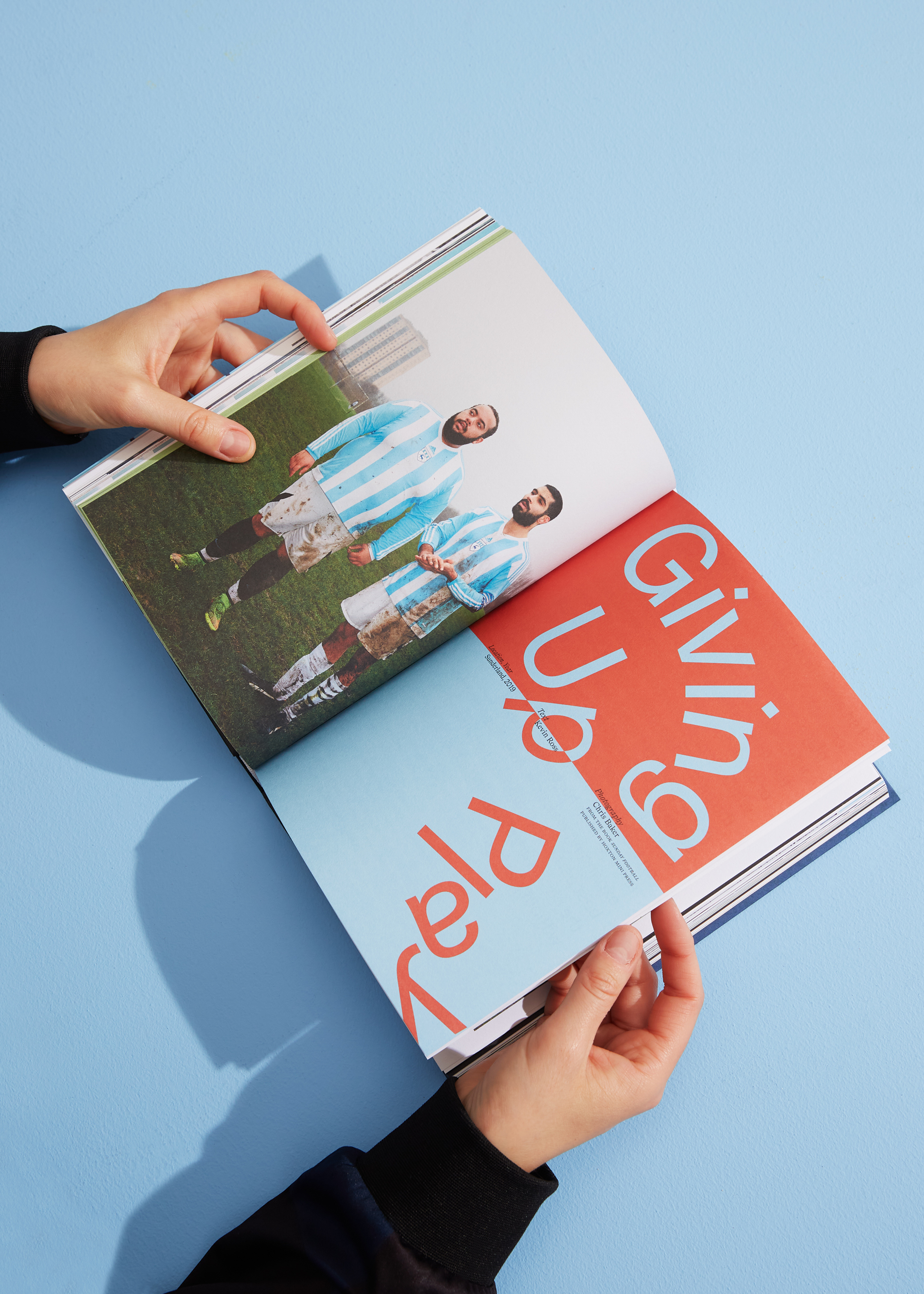
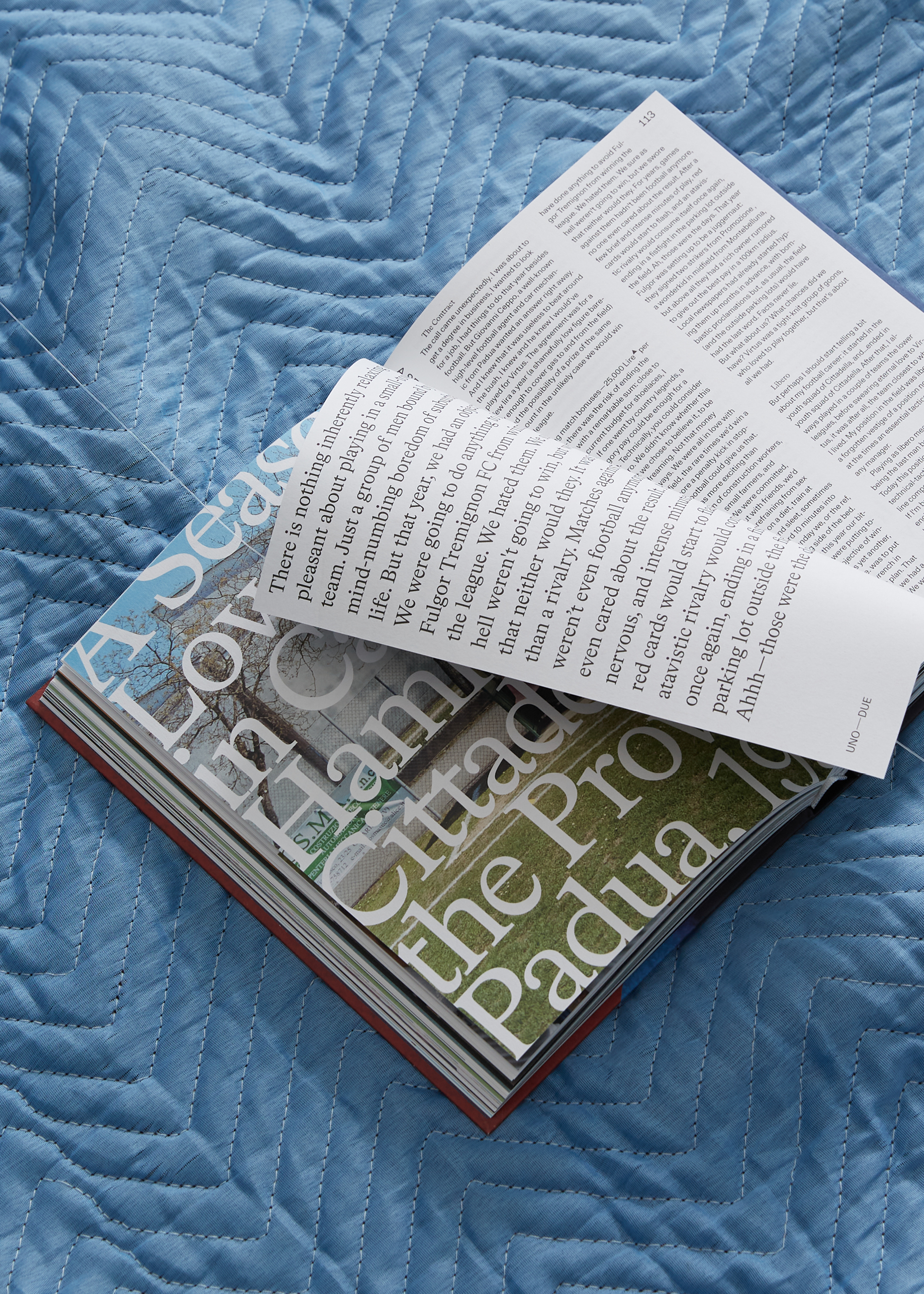
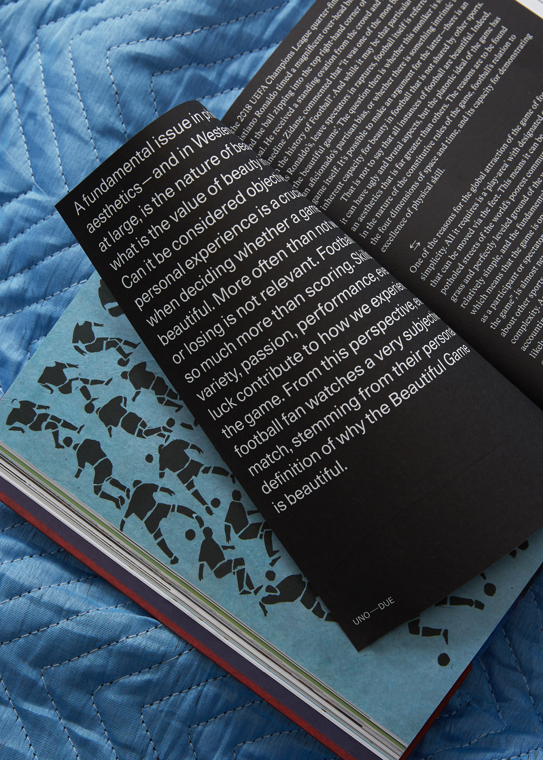
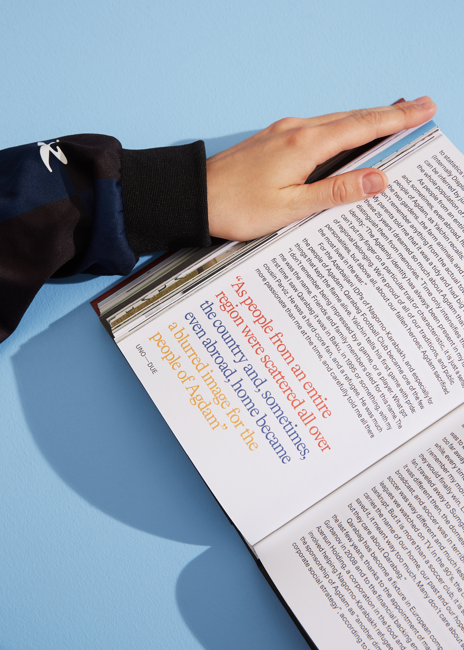
The third volume, called “It’s Personal”, features an entirely redesigned identity and layout: the grid and typographic systems play off the idea of a one-two (referenced in the publication title ”Uno-Due“), using a combination of a single weight of a Sans (Unica77) and Serif (LL Bradford) that are used interchangeably for display and text. The layouts of the openers play with typographic expression, capturing the subject matter through form and composition, activating the kinetic energy of the sport in typographic form.
︎ Designed in collaboration with Lorenzo Fanton
︎ Purchase Uno–Due magazine here
Role .................. Design & creative direction
Field ................. Identity, Technology
Typefaces ............. Unica77 + LL Bradford by Lineto
Editorial Directors ... Andrea Timpani, Matteo Cossu, e Daniele Sigalot
PM + Editor ........... Matteo Cossu
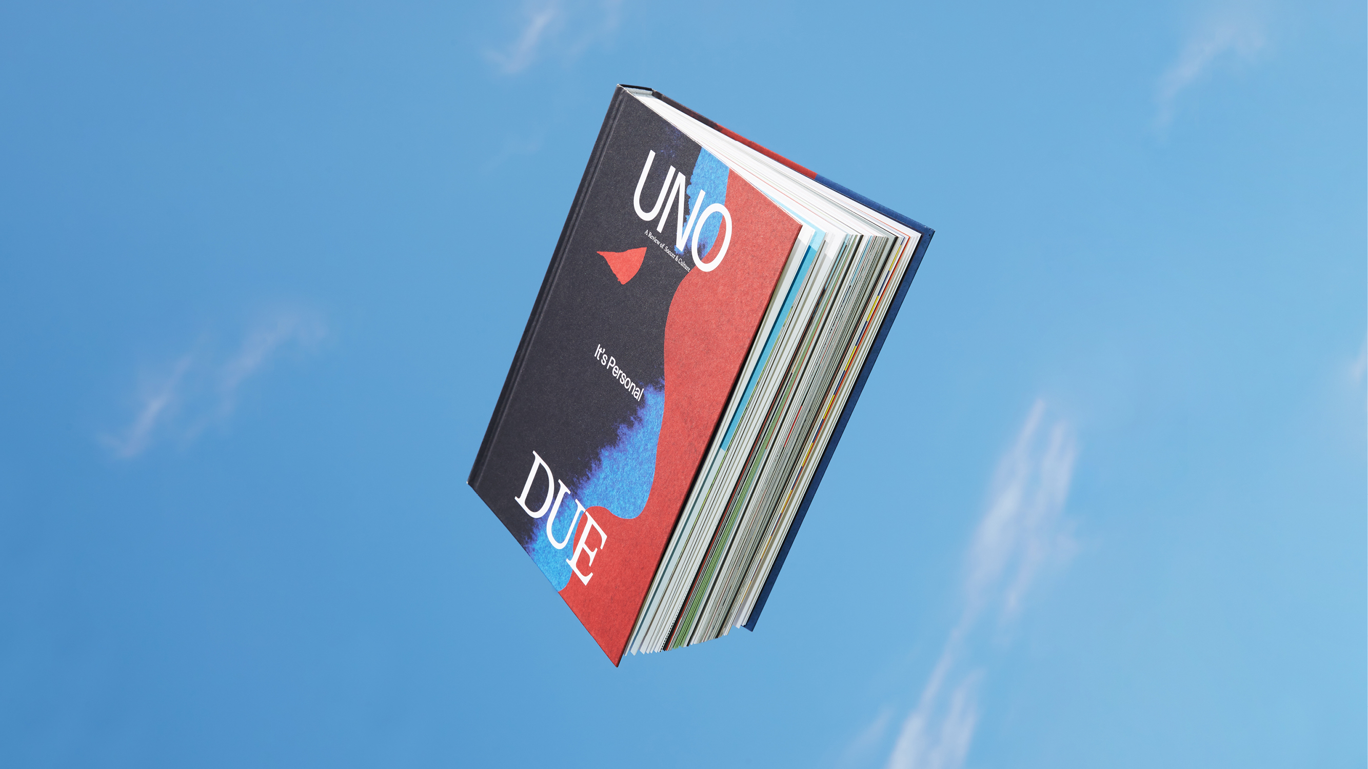
Cover Illustration .... Azar Mazimir
Published ............. Summer 2021
Uno–Due is a yearly publication on football and culture. Football (Soccer) is an essential element of world culture, a sport that moves millions of people daily. Using the Beautiful Game as a springboard, Uno-Due delves into its reverberations on society and culture through human stories that go beyond the field, but are always connected to it.
Solution
The third volume, called “It’s Personal”, features an entirely redesigned identity and layout: the grid and typographic systems play off the idea of a one-two (referenced in the publication title ”Uno-Due“), using a combination of a single weight of a Sans (Unica77) and Serif (LL Bradford) that are used interchangeably for display and text. The layouts of the openers play with typographic expression, capturing the subject matter through form and composition, activating the kinetic energy of the sport in typographic form.
︎ Designed in collaboration with Lorenzo Fanton
︎ Purchase Uno–Due magazine here
Role .................. Design & creative direction
Field ................. Identity, Technology
Typefaces ............. Unica77 + LL Bradford by Lineto
Editorial Directors ... Andrea Timpani, Matteo Cossu, e Daniele Sigalot
PM + Editor ........... Matteo Cossu
Cover Illustration .... Azar Mazimir
Published ............. Summer 2021
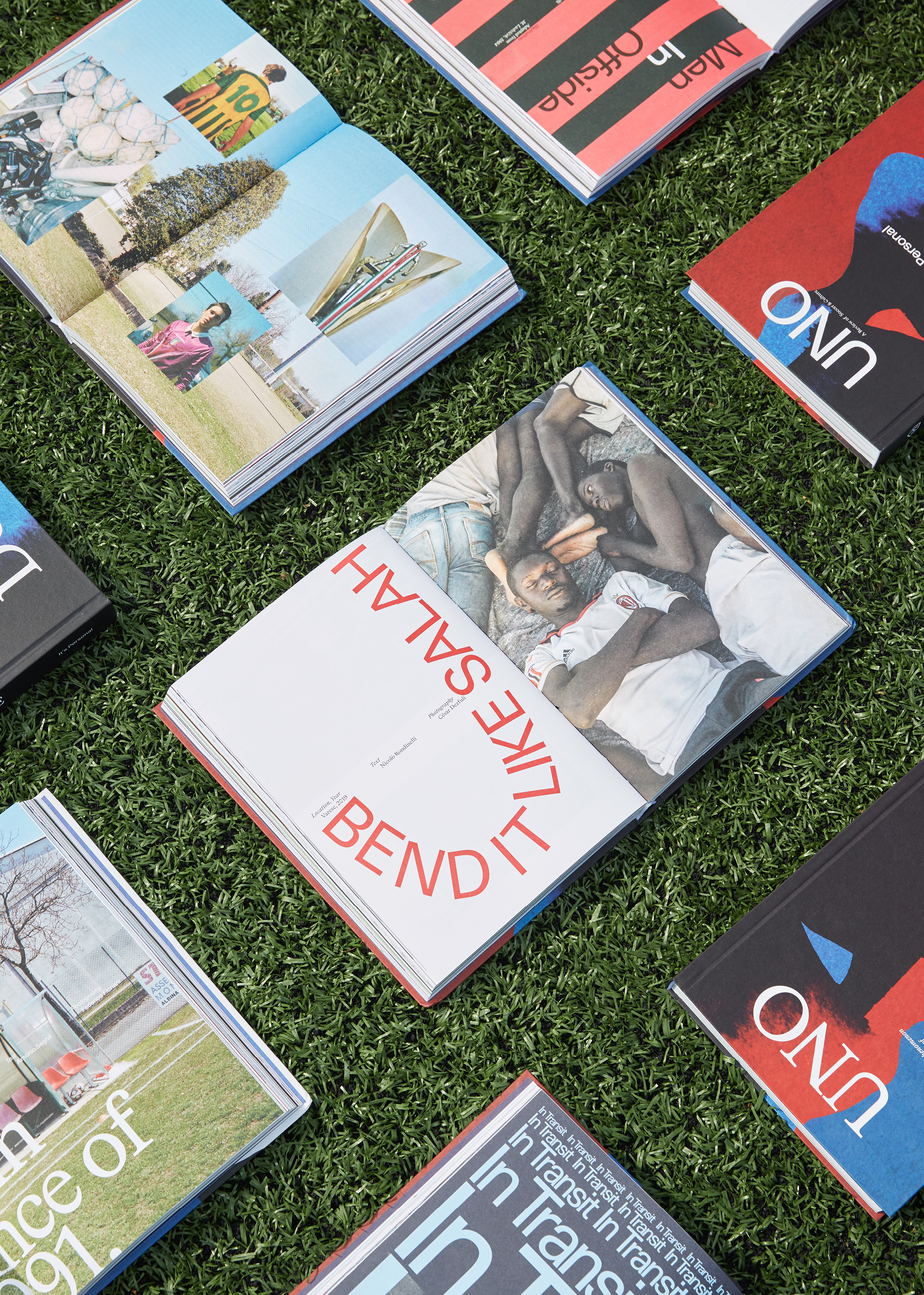
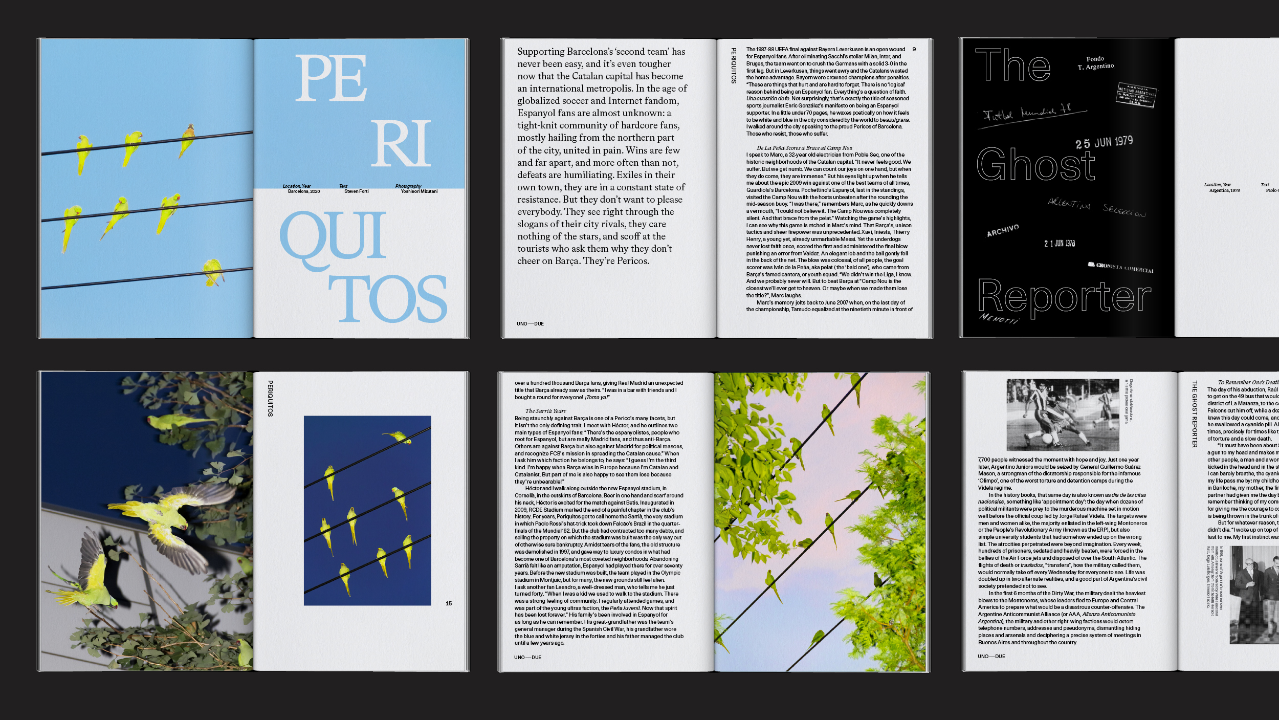
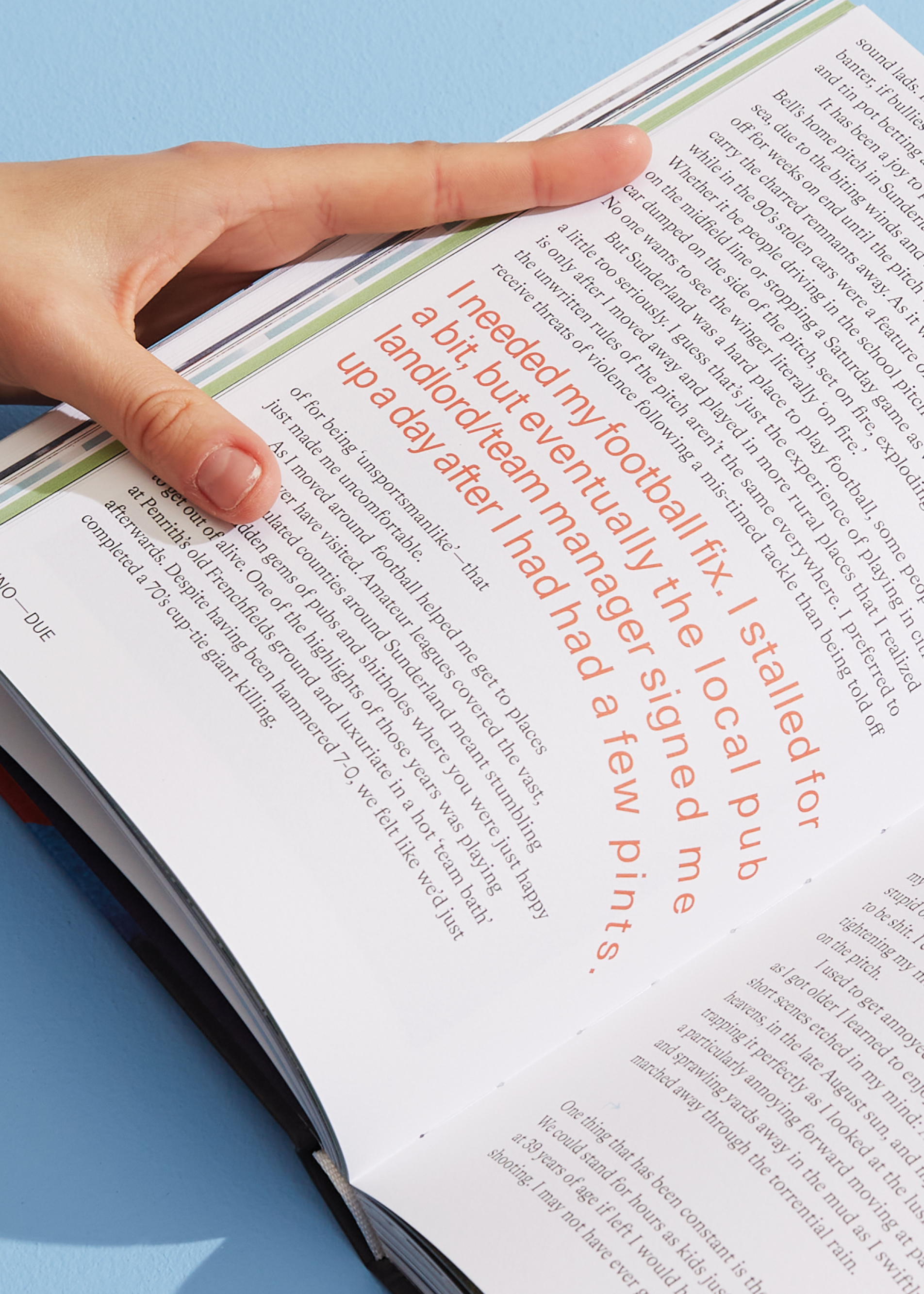
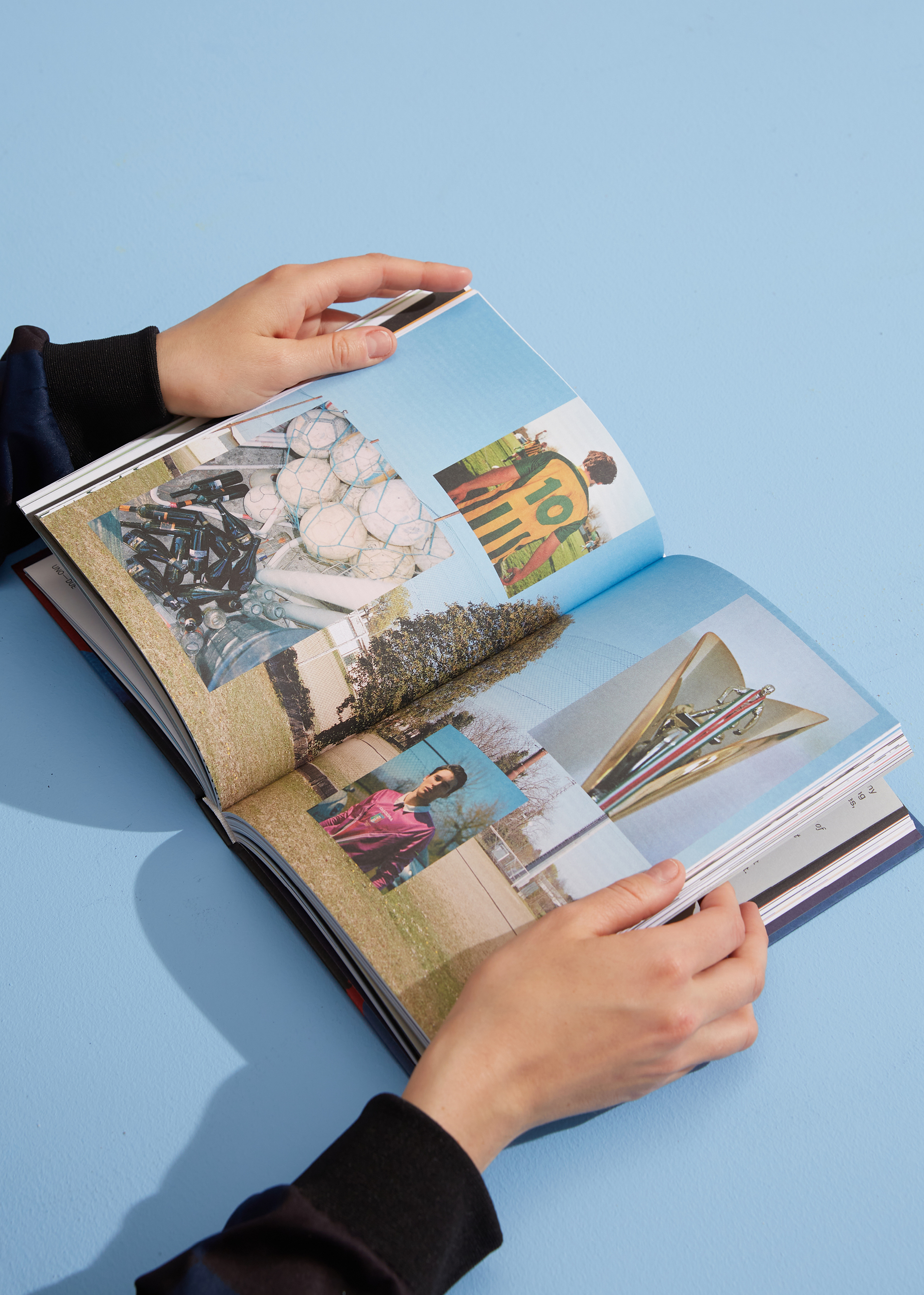
Typographic energy from football culture
The typography interprets the spirit of football (or soccer), with its dynamic, inventive and fluid energy, which anyone who has experienced the sport would’ve seen alive on and off the field.

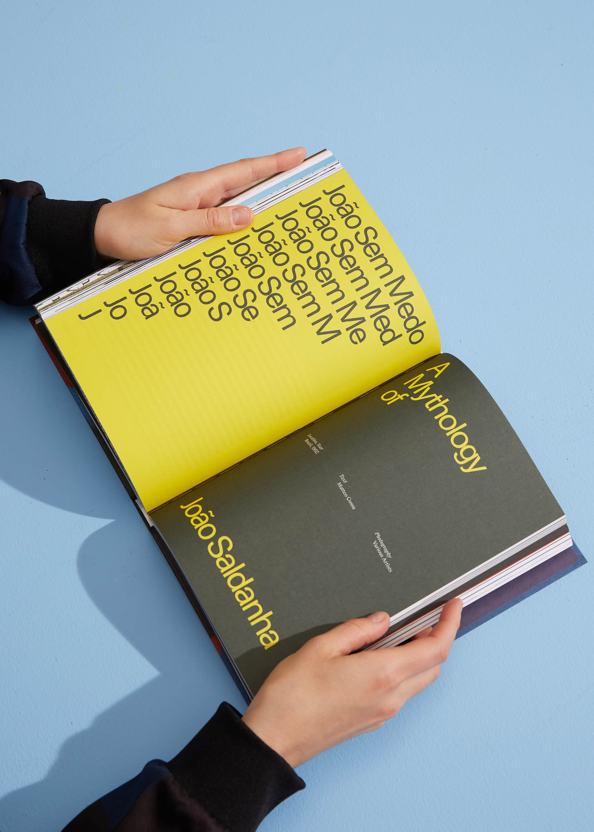


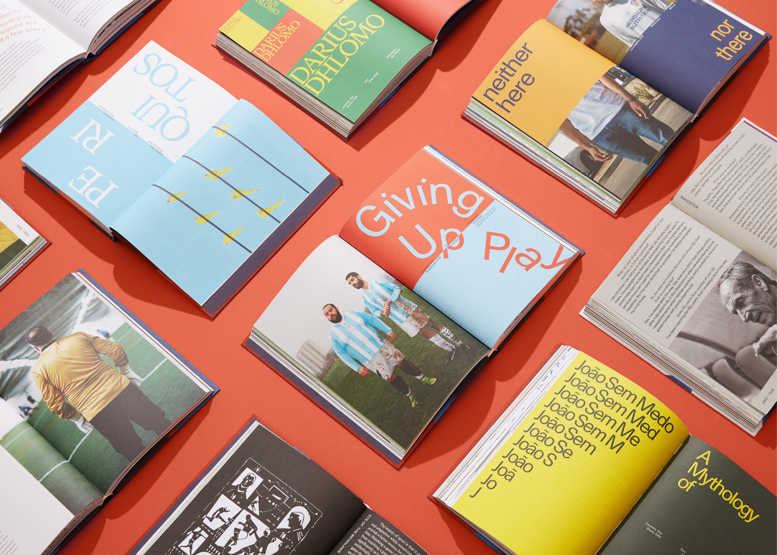
Interplay between two typographic voices
Using two contrasting, yet straightforward typographic voices (a single regular weight of Unica77 and LL Bradford), the concept of UNO–DUE (one–two) is interpreted.
This simplicity in the typographic palette is built with legibility first in mind, and gives room to playful interpretations of each article in the article openers.

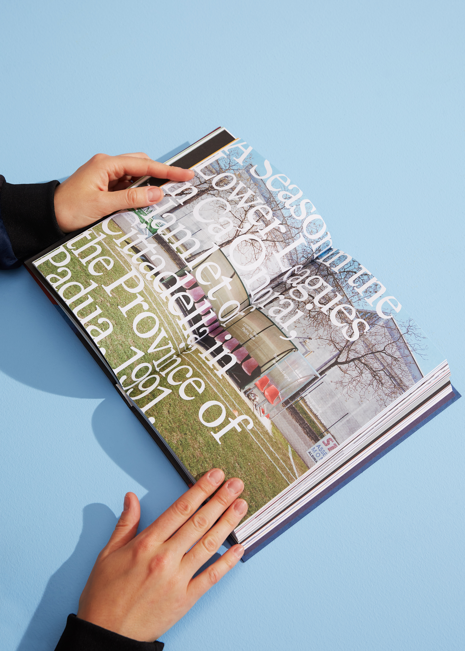
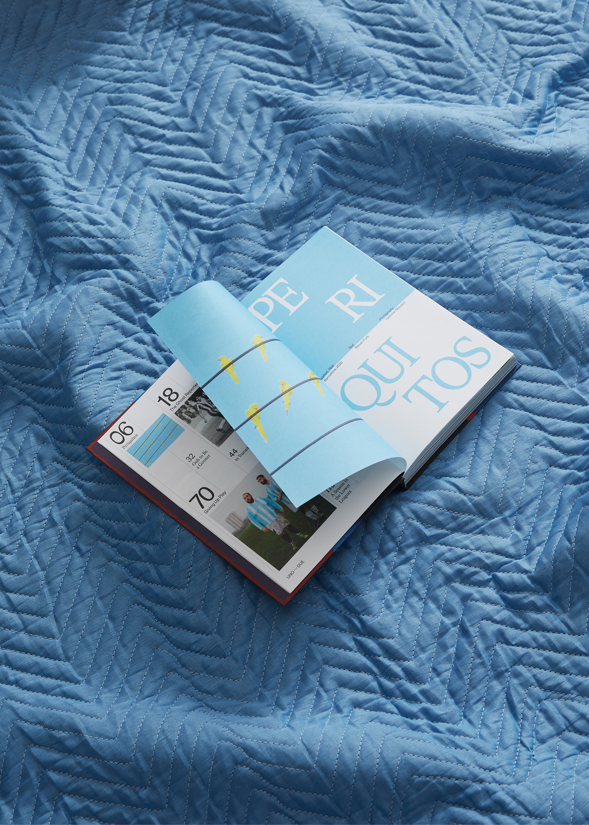
Structure that plays off the 1–2
The idea of one–two is also used to structure the page, most visible within the openers, which feature color harmonies in blocks arranged in twos (either half a spread or half a page). The grid itself is built in 1–2 units as well, to give the entirety of the publication, typographic rhythm.