The National
Brief
Design the album artwork & release campaign for the 7th album of one of the world’s biggest indie bands, The National.
Solution
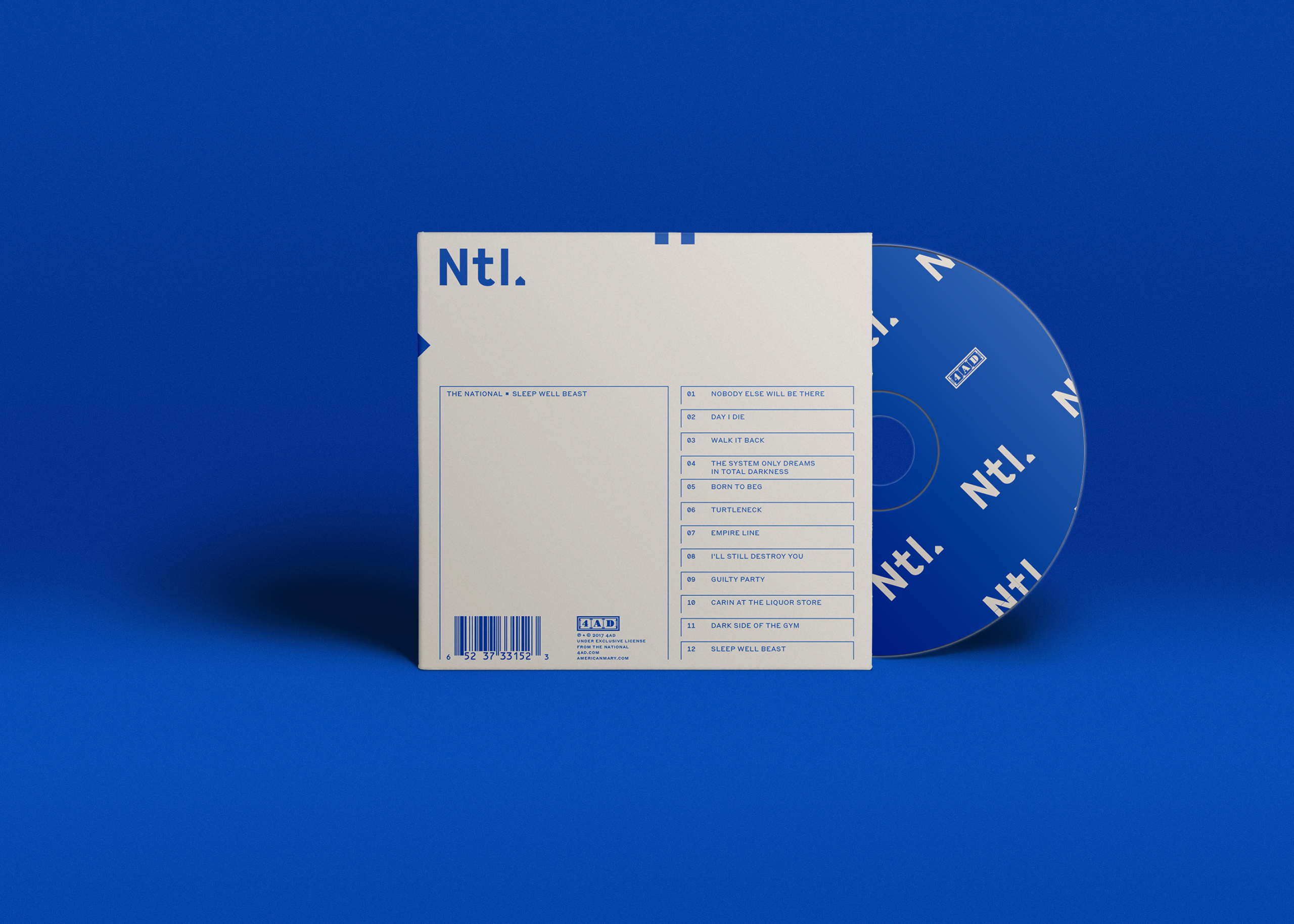
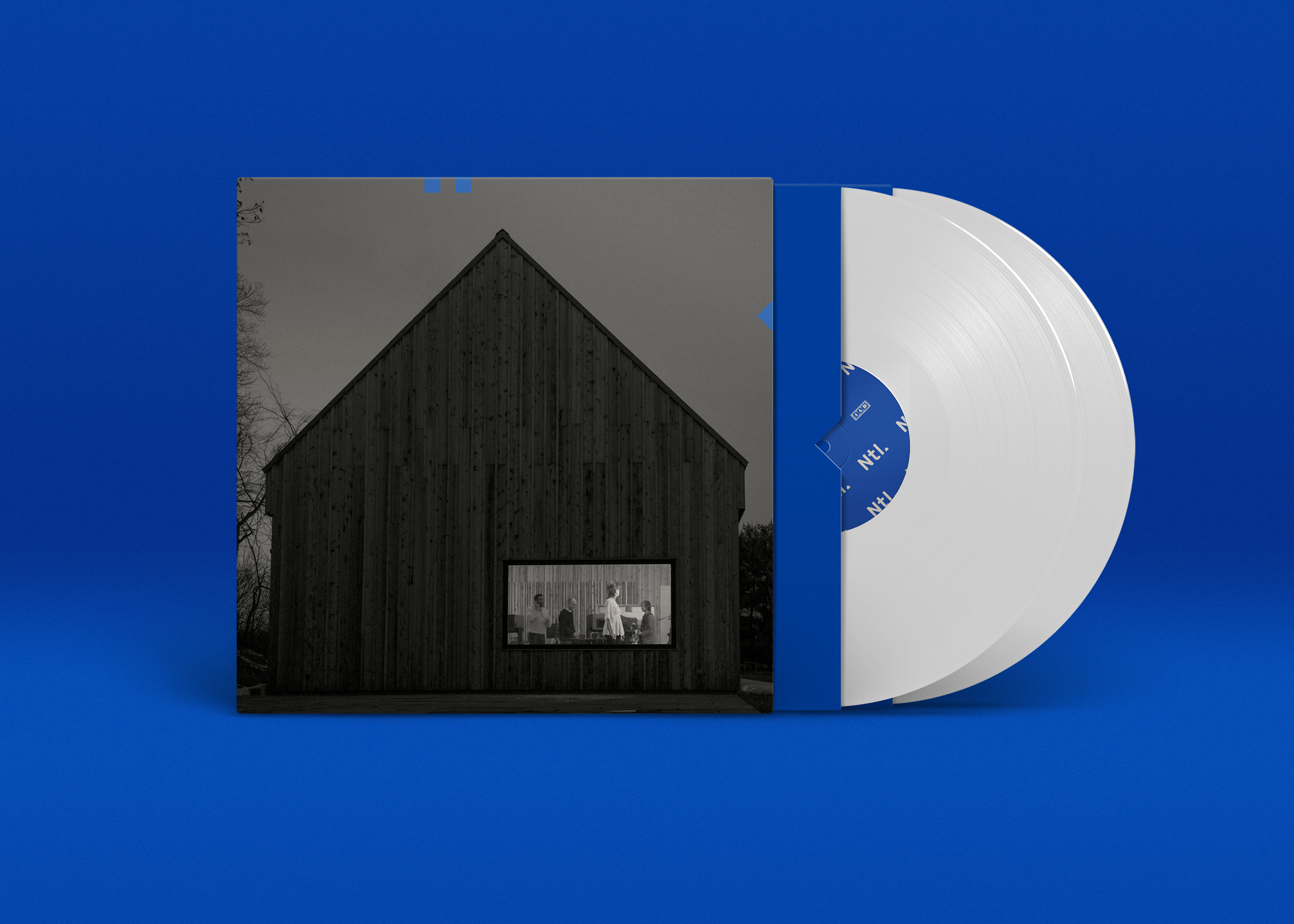
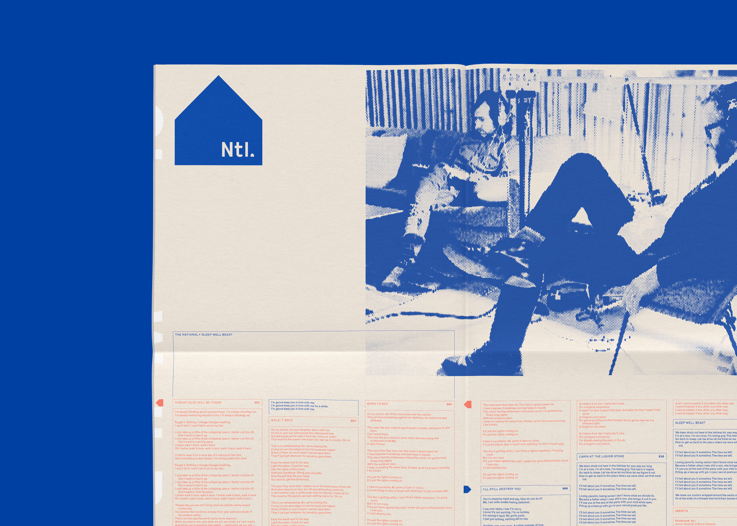
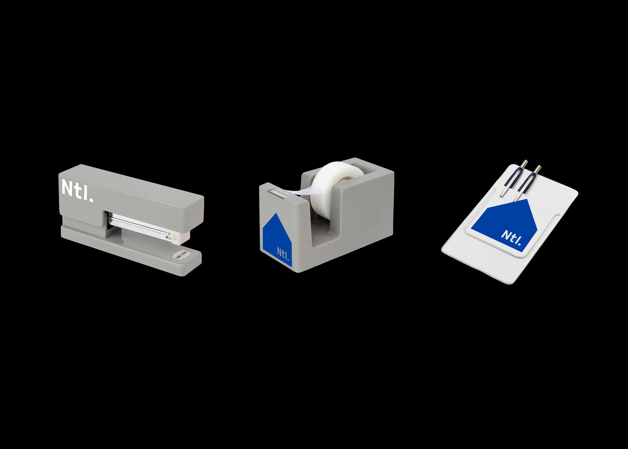
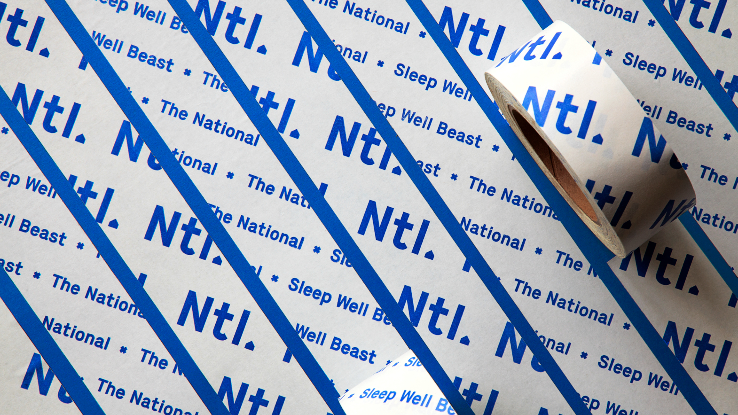
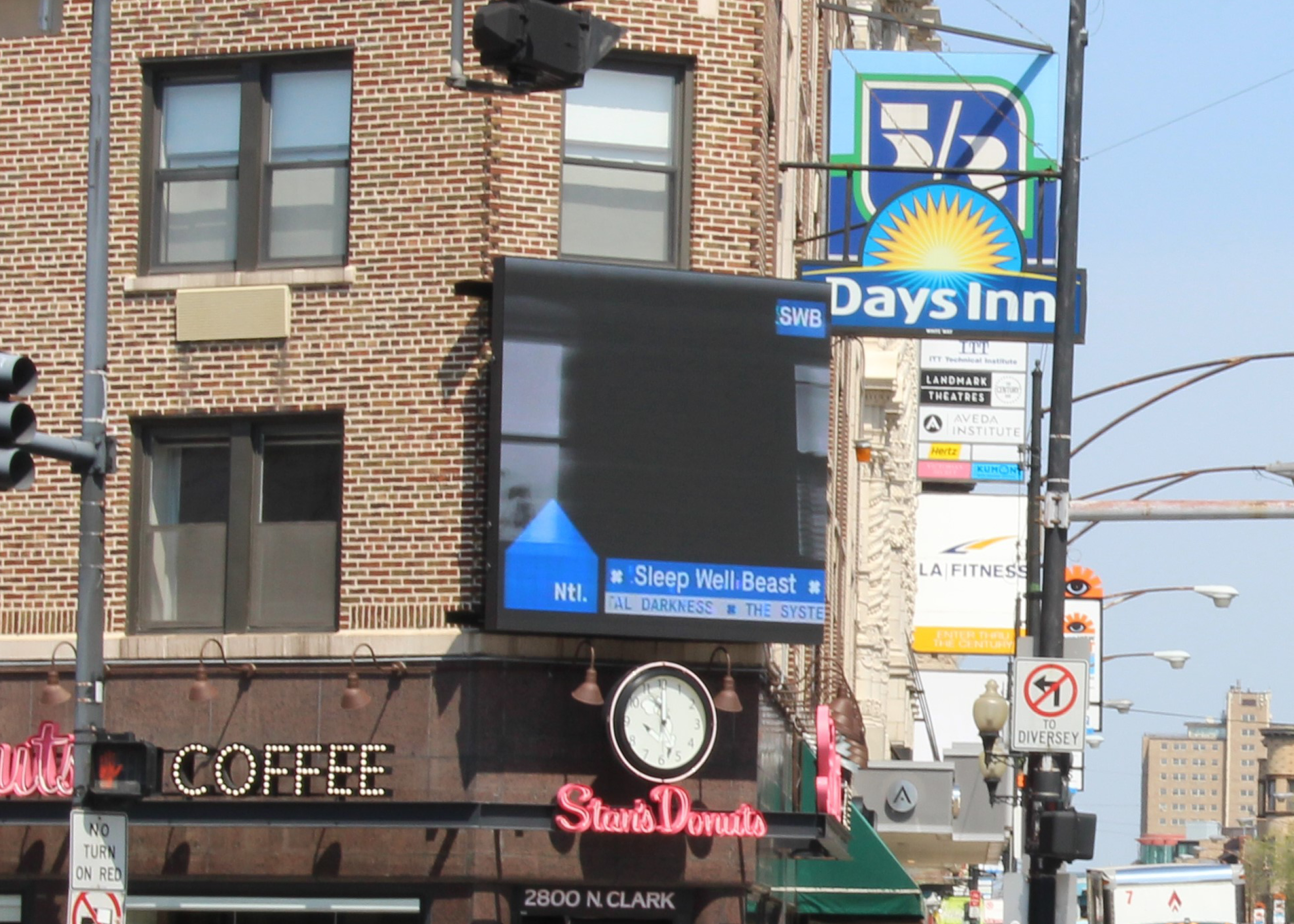
Along with the band, we developed the idea—fully ironic—that an indie band would have its own full-on corporate identity, even going so far as to produce a corporate standards manual.
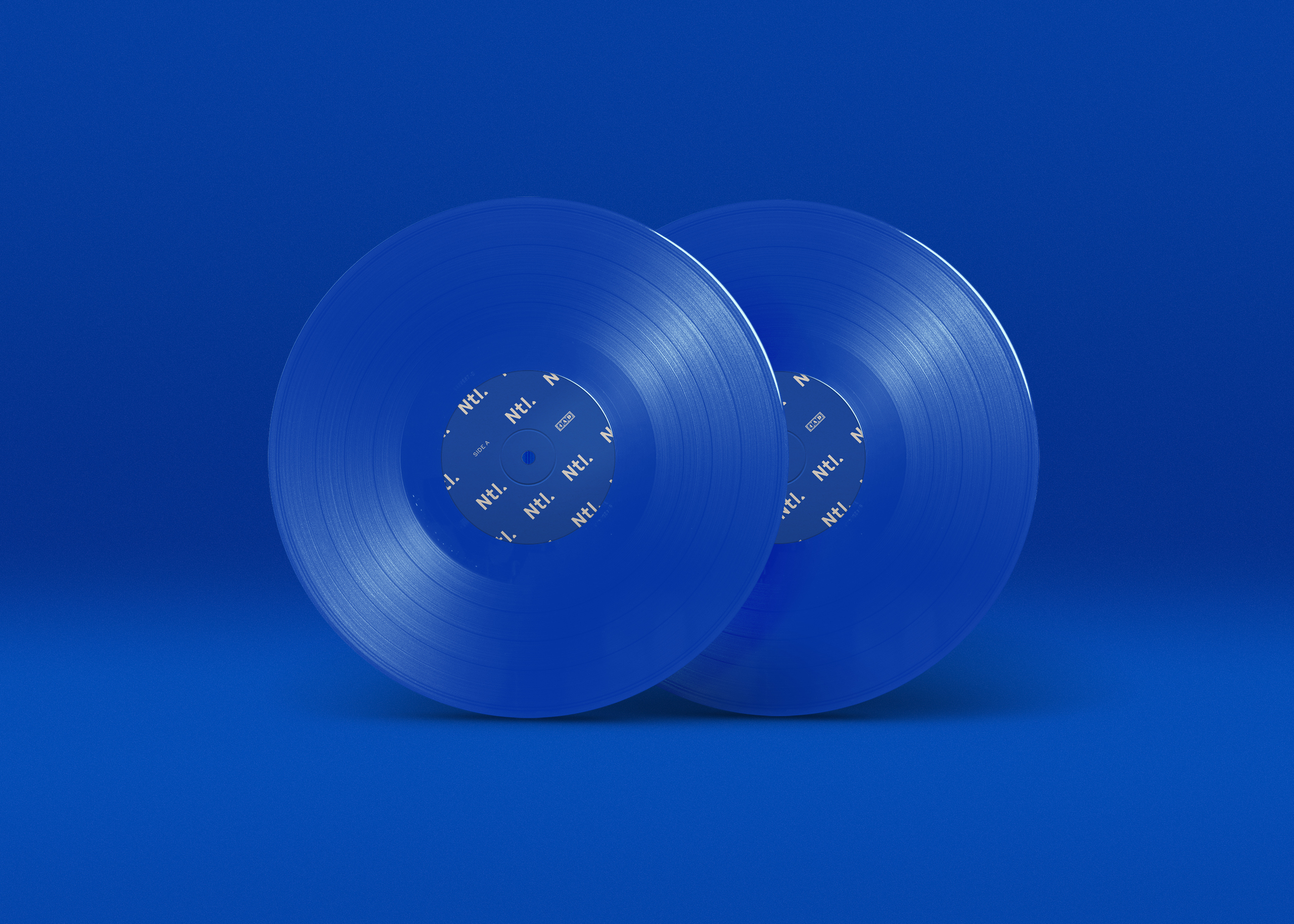
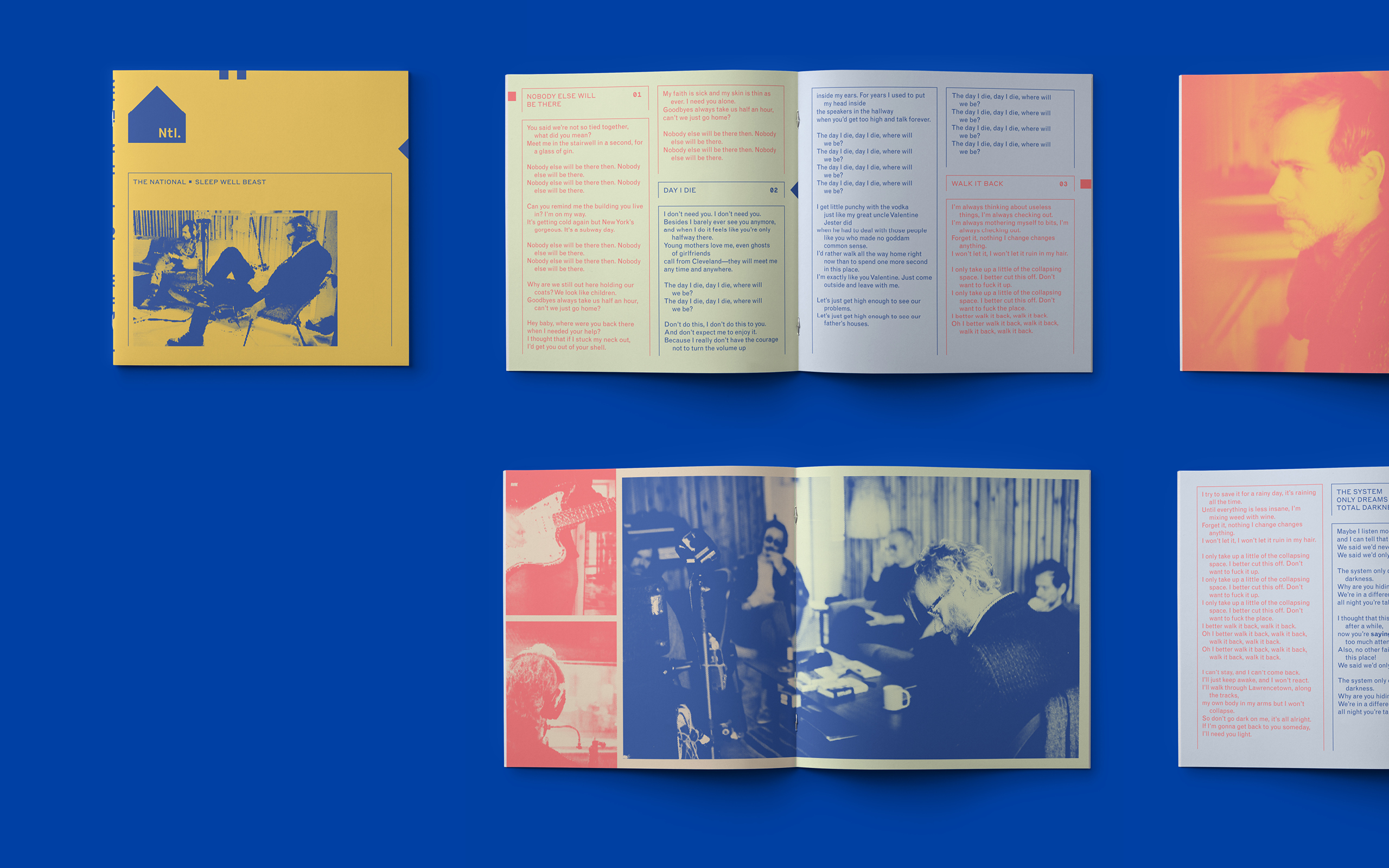
The visual moves to do so were: (1) creating a logo based on the location where they recorded the albums, (2) using a restricted color palette as brand colors and (3) establishing a typographic fabric and layouts that mimicked (and poked fun at) the history of beaurocratic forms. Then we consistently played these elements out throughout any piece of communication.
Awards
GRAMMY® Nominated for Best Album Package (2017)
Type Director’s Club Communication Design Winner (2017)
Society of Typographic Arts’s (STA) 100 Winner (2018)
Press
It’s Nice That, Dezeen, Creative Review
Creative Direction .... Luke Hayman
Role .................. Lead designer
Team .................. Elyanna Blaser-Gould
Studio ................ Pentagram
Field ................. Brand identity, Music
Published ............. June 2017
Typefaces ............. Maison by Milieu Grotesque, Styrene by Berton Hasebe (Commercial Type)
Design the album artwork & release campaign for the 7th album of one of the world’s biggest indie bands, The National.
Solution
Along with the band, we developed the idea—fully ironic—that an indie band would have its own full-on corporate identity, even going so far as to produce a corporate standards manual.
The visual moves to do so were: (1) creating a logo based on the location where they recorded the albums, (2) using a restricted color palette as brand colors and (3) establishing a typographic fabric and layouts that mimicked (and poked fun at) the history of beaurocratic forms. Then we consistently played these elements out throughout any piece of communication.
Awards
GRAMMY® Nominated for Best Album Package (2017)
Type Director’s Club Communication Design Winner (2017)
Society of Typographic Arts’s (STA) 100 Winner (2018)
Press
It’s Nice That, Dezeen, Creative Review
Creative Direction .... Luke Hayman
Role .................. Lead designer
Team .................. Elyanna Blaser-Gould
Studio ................ Pentagram
Field ................. Brand identity, Music
Published ............. June 2017
Typefaces ............. Maison by Milieu Grotesque, Styrene by Berton Hasebe (Commercial Type)