Tend
Brand Identity
A banking collective for mutual financial growth
Tend is redefining the notion of community banking by allowing users to co-create its offering and providing a platform for peer-to-peer financial advice. It champions financial mobility by providing unbanked and underbanked demographics with access to services, rewards and income.
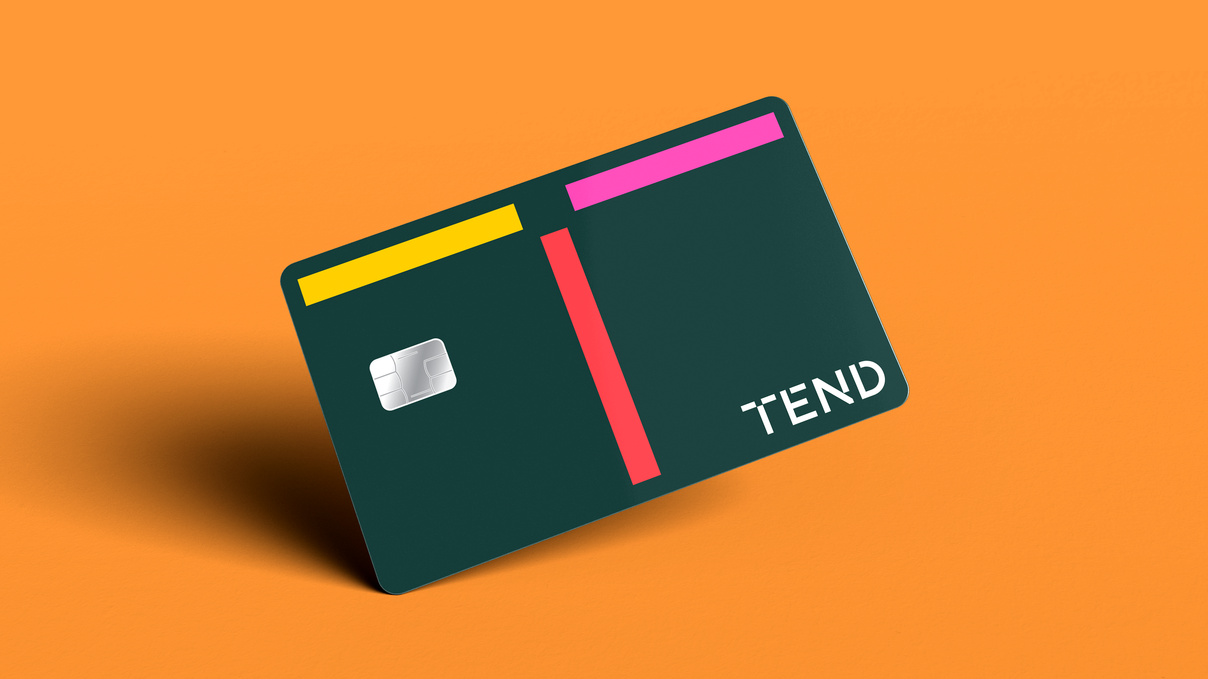
Positioned uniquely as the world’s first banking collective, the new brand embodies the experience of community and it underscores the open exchange between customers and the company.
The new name is both a promise and a cue to the collective; Tend is active and intentional, warm and inviting. It implies caring for something other than oneself and nods to growth and progress; inherently human ideas. Paired with a direct and irreverent brand voice, and a boldly confident identity system, Tend steps forward as a visionary in personal finance.
Designed at Gretel
Role .................. Creative Director & Designer
Team .................. STRATEGY: Daniel Edmudson, Galla Barrett, Mahek Singh / PM: Pedro Corzo / DESIGN: Anna Kulachek, Nicholas Samendinger, Lea Loo, Marques Oden, Ryan Moore, myself.
Field ................. Identity, FinTech
Typefaces ............. Pilat by General Type
Published ............. January 2021
Design System
The ideas at the center of the brand are growth and connection. The logo activates those ideas but it’s not a matter of simply applying the logo everywhere; here the logo, the behavior, and the system are all one.
Overall, the system remains lean, direct, plainspoken and accessible.

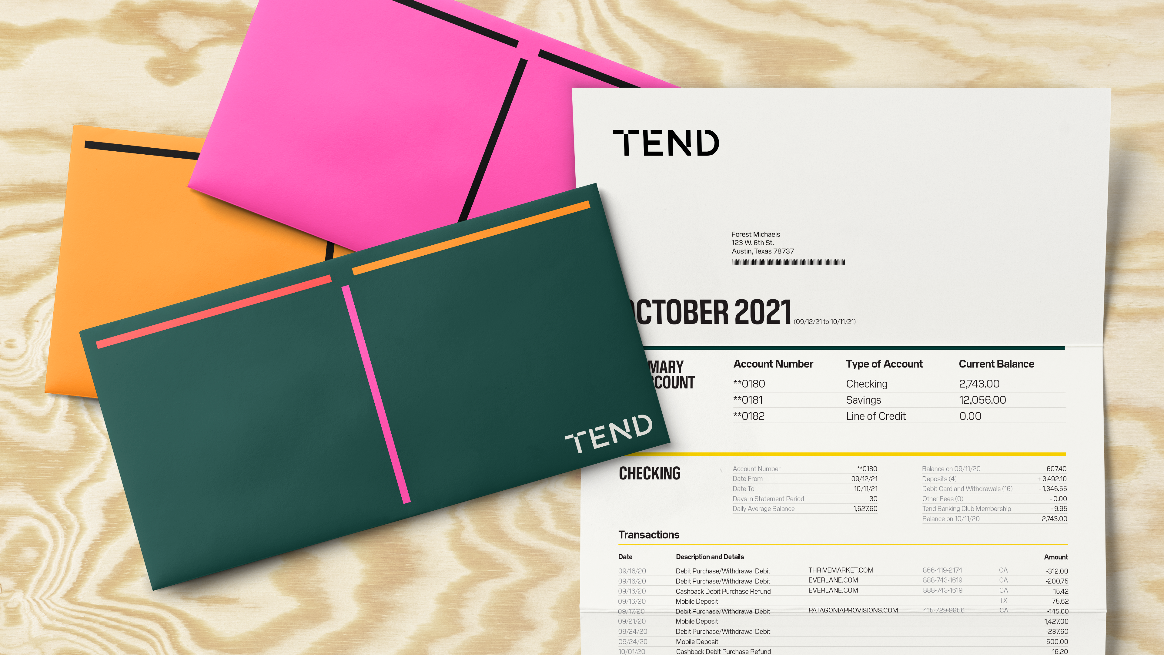
Color plays a critical role in the expression of the identity. The primary palette is composed of a youthful set of vibrant, warm colors, which stand confidently apart from the FinTech category. They are used to activate energy and expression in the system, or become helpful accents when combined with dark green and neutrals.

Typography is the channel for Tend’s direct, irreverent and bold tone of voice. The typographic palette is made up of Pilat and Pilat Condensed by General Type, which enables the design system to scale from confident and punchy moments, to conveying information in a clear and functional way.


Simple graphics combine with type and color to create a powerful mix of useful information design—which in turn becomes a subtle shorthand for Tend’s identity system. Non-essential elements are stripped away from diagrams to keep information clear and accessible, while keeping a bold attitude through use of typography and color.![]()

