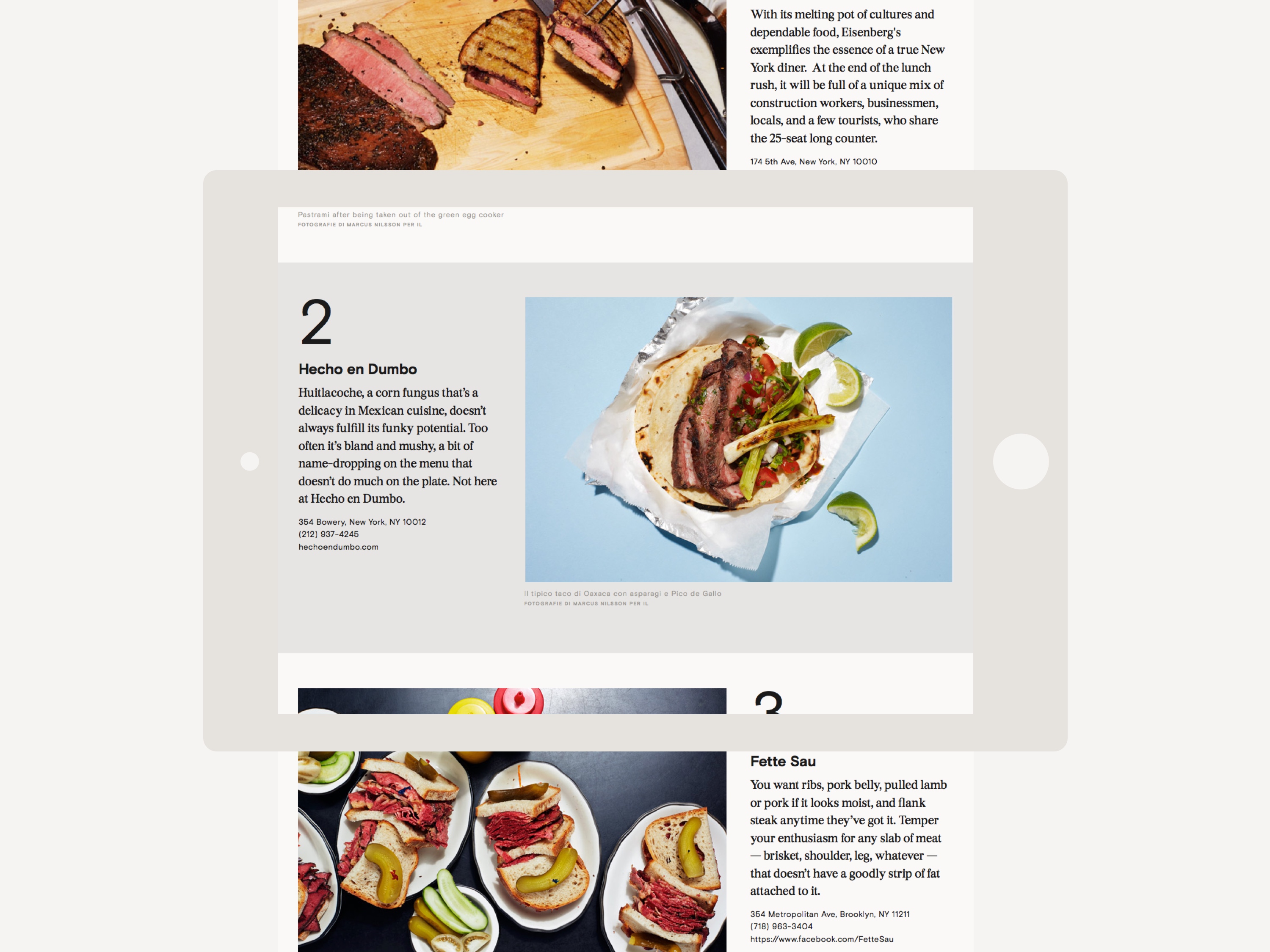
IL Magazine website
Brief
Design the first website for the iconic IL Magazine.
Solution
In the fall of 2015, I had the great opportunity to lead the design of the website for IL Magazine (the monthly magazine published by Il Sole 24 ORE), alongside the super-talented duo Francesco Franchi and Davide Mottes.
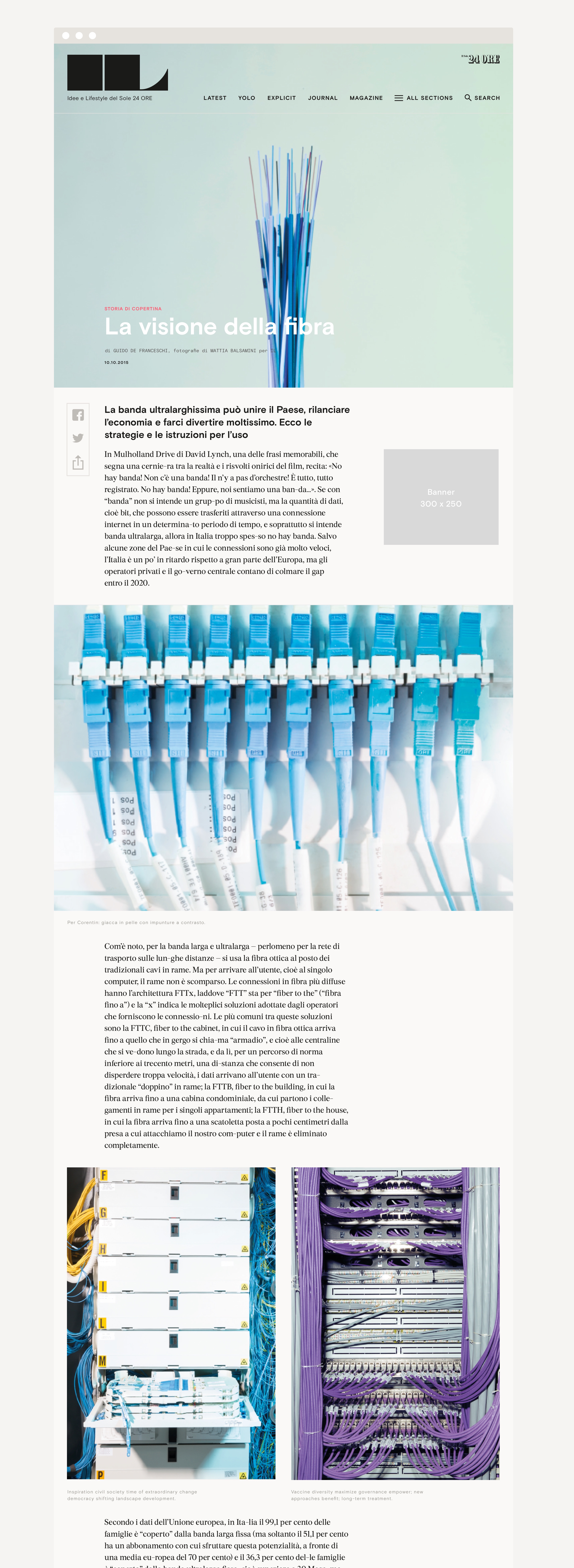
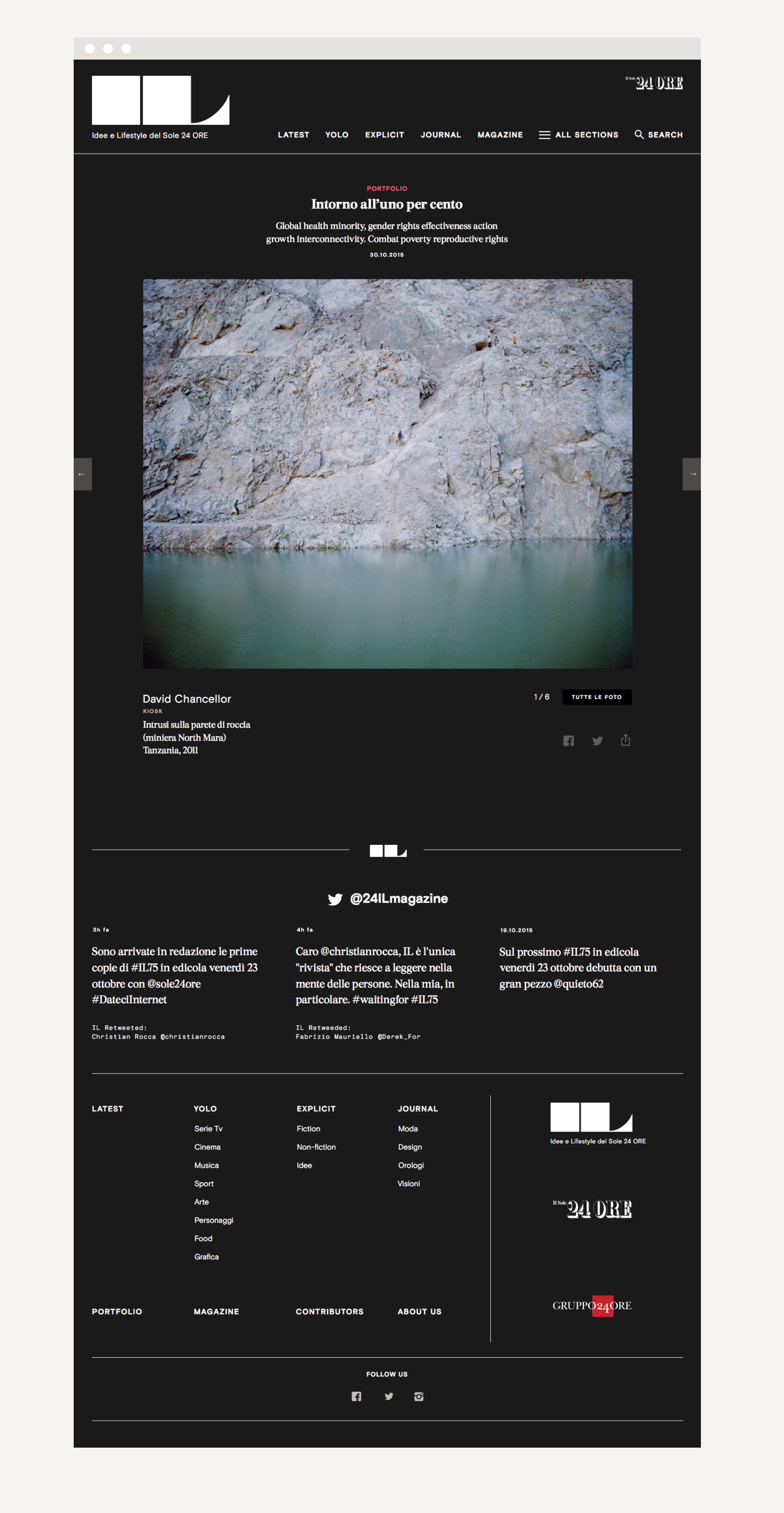
The brief was to translate the magazine’s print identity into the web, while evolving its voice to fit the new digital context. Focus was put on typography, photography and illustration, giving a clear and simple treatment to allow the content to come to the fore.
Since the launch of the new site, the talented IL Magazine team has been hard at work at evolving the content tailored for the print magazine into versions that truly adapt to the web. It's exciting to see how the site’s content has been evolving.
Role ·················· Lead designer
Creative Direction ···· Francesco Franchi
Team ·················· Davide Mottes, Adriana Chiaia
Field ················· Web, Editorial
Published ············· December 2017
Typefaces ············· Basis Grotesque + Mono, Burgess
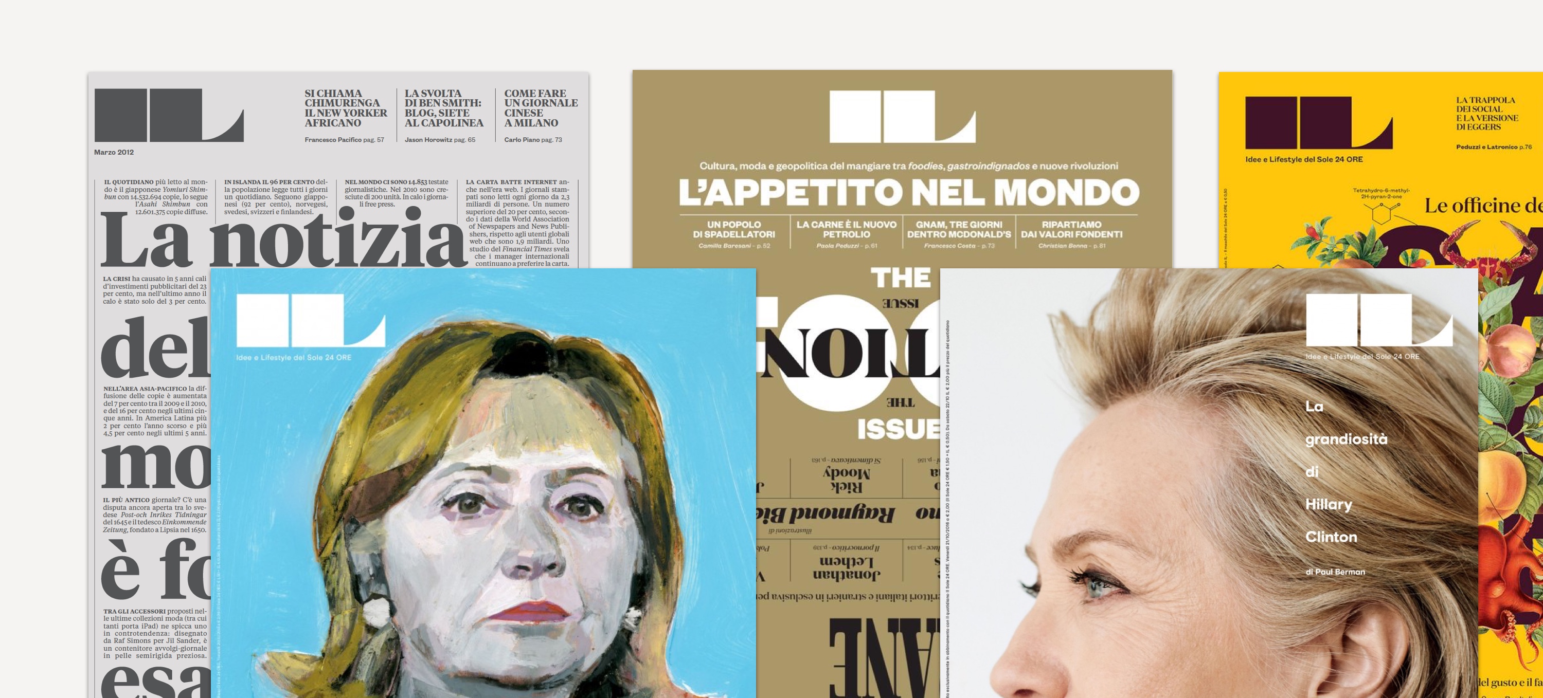


Homepage
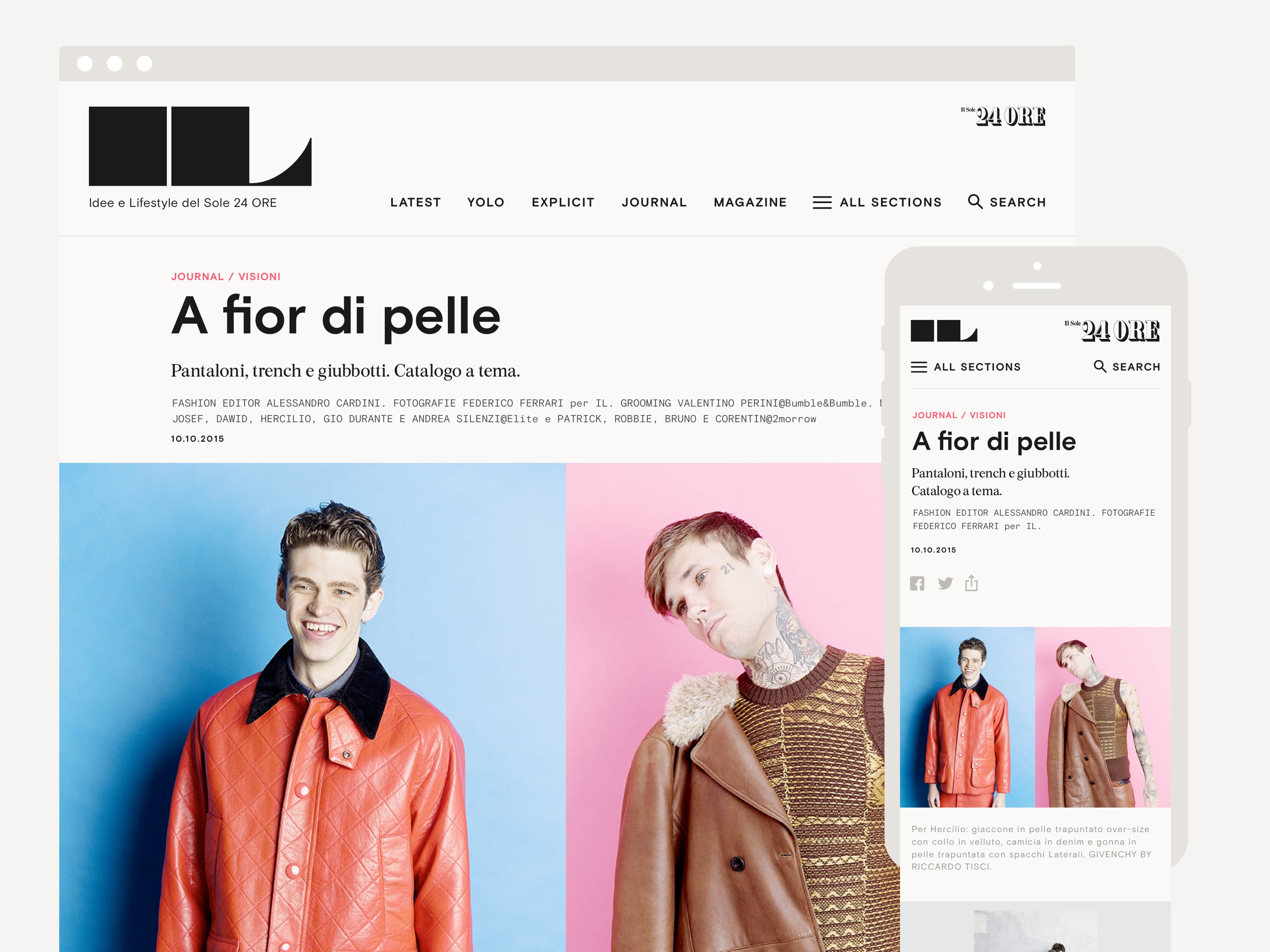
Supernav / Desktop Hover
Article pages
Search & Filters

Section Openers
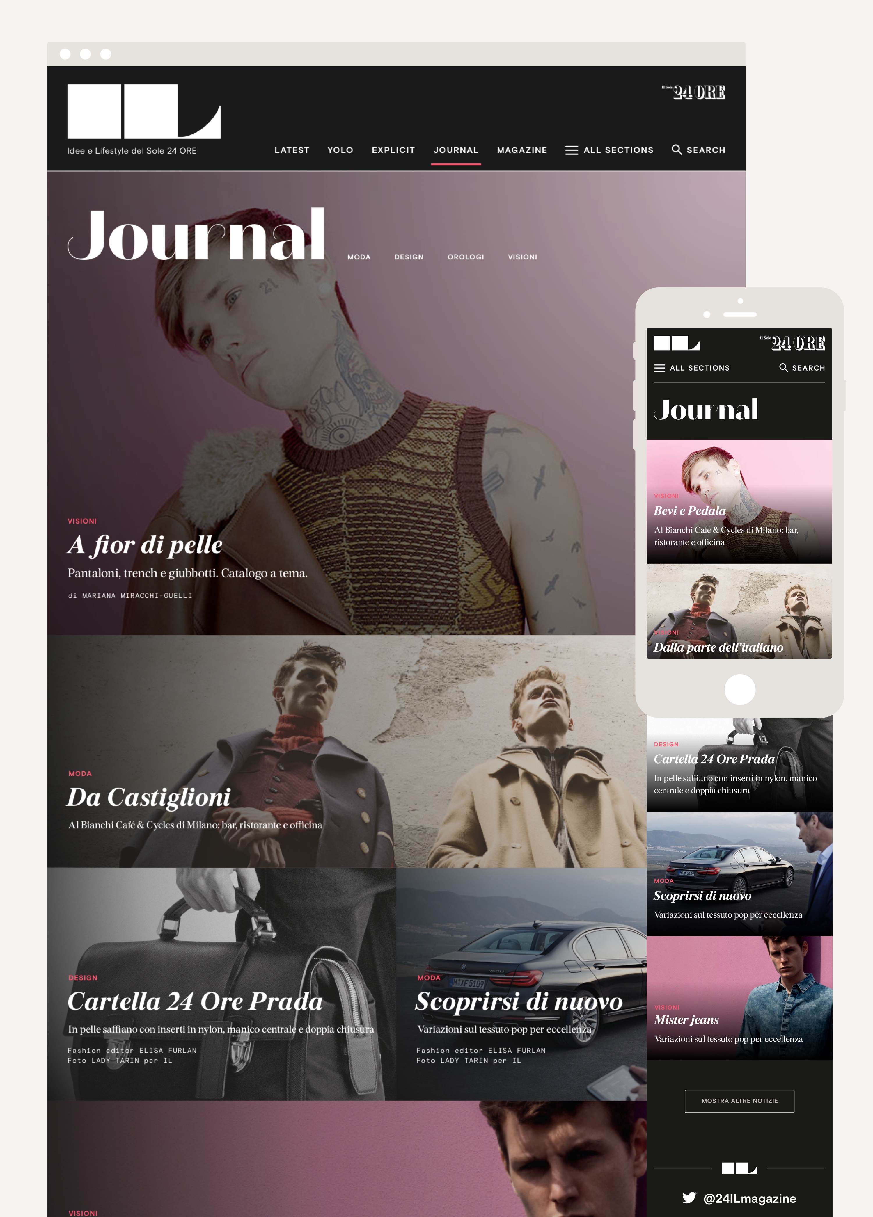
The biggest challenge was to brand each of the magazine’s sections (YOLO, Explicit, Journal, etc.), while preserving cohesion across the site and navigability. This was achieved by subtle changes in typography, background colors, and grid uses.
