Cirrus & Stratus Realty
Brief
Develop the logo and brand identity for two sister companies operating out Virginia.
Solution
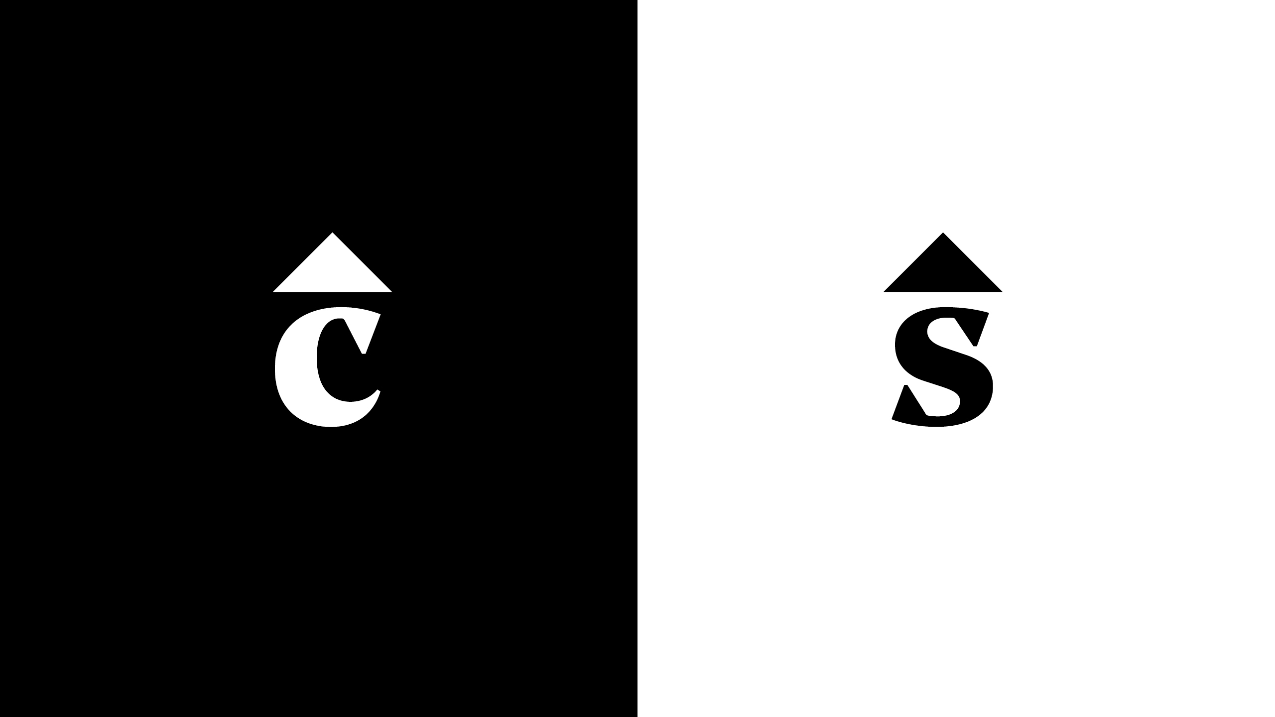
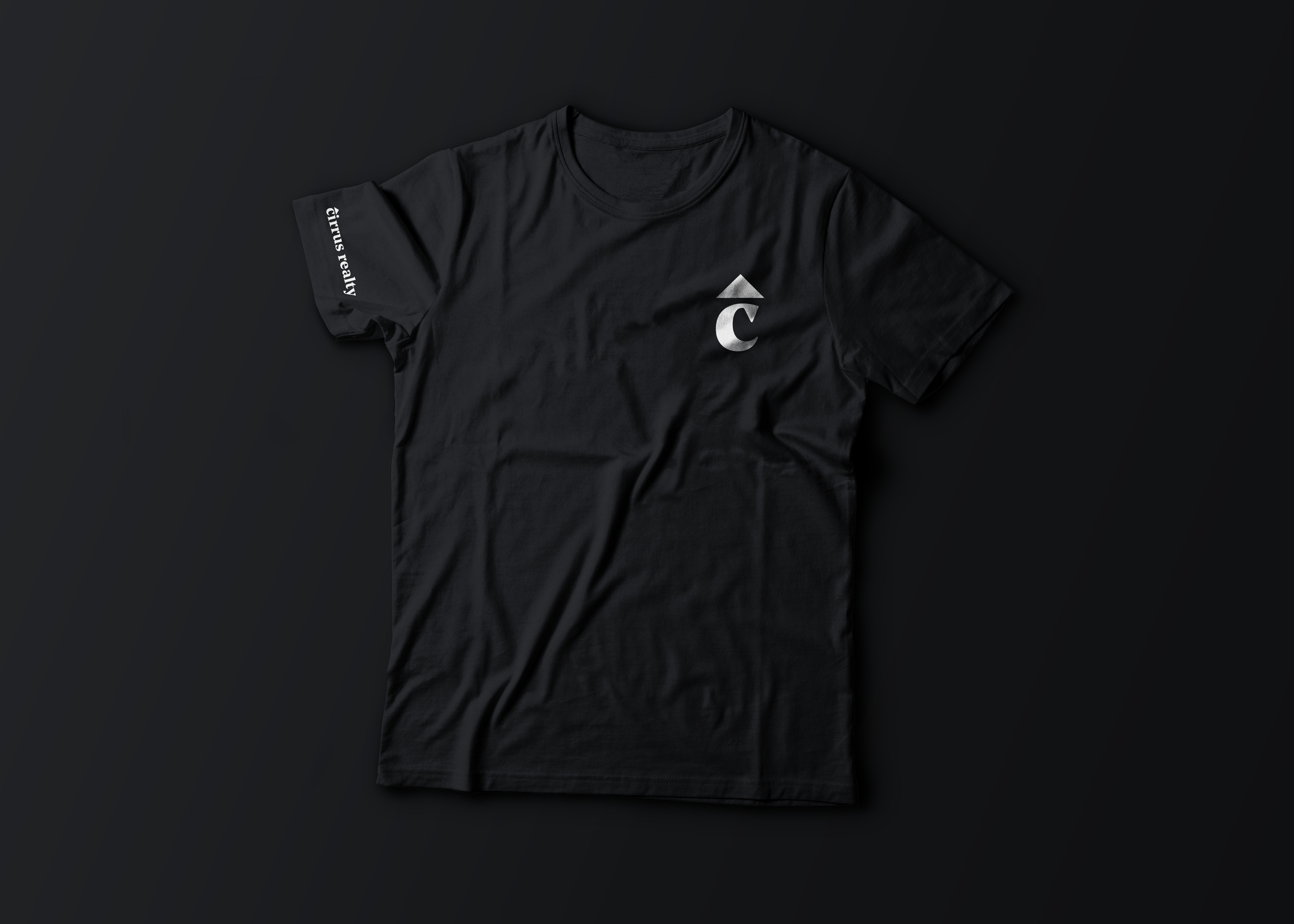
The idea of home has often been distilled down to a roof. By pairing this simple shape with a beautiful wedge serif typeface (Noe Text by Schick Toikka) that contains the same exact graphic gestures (triangular shapes), a sense of unity is created in the logotype.
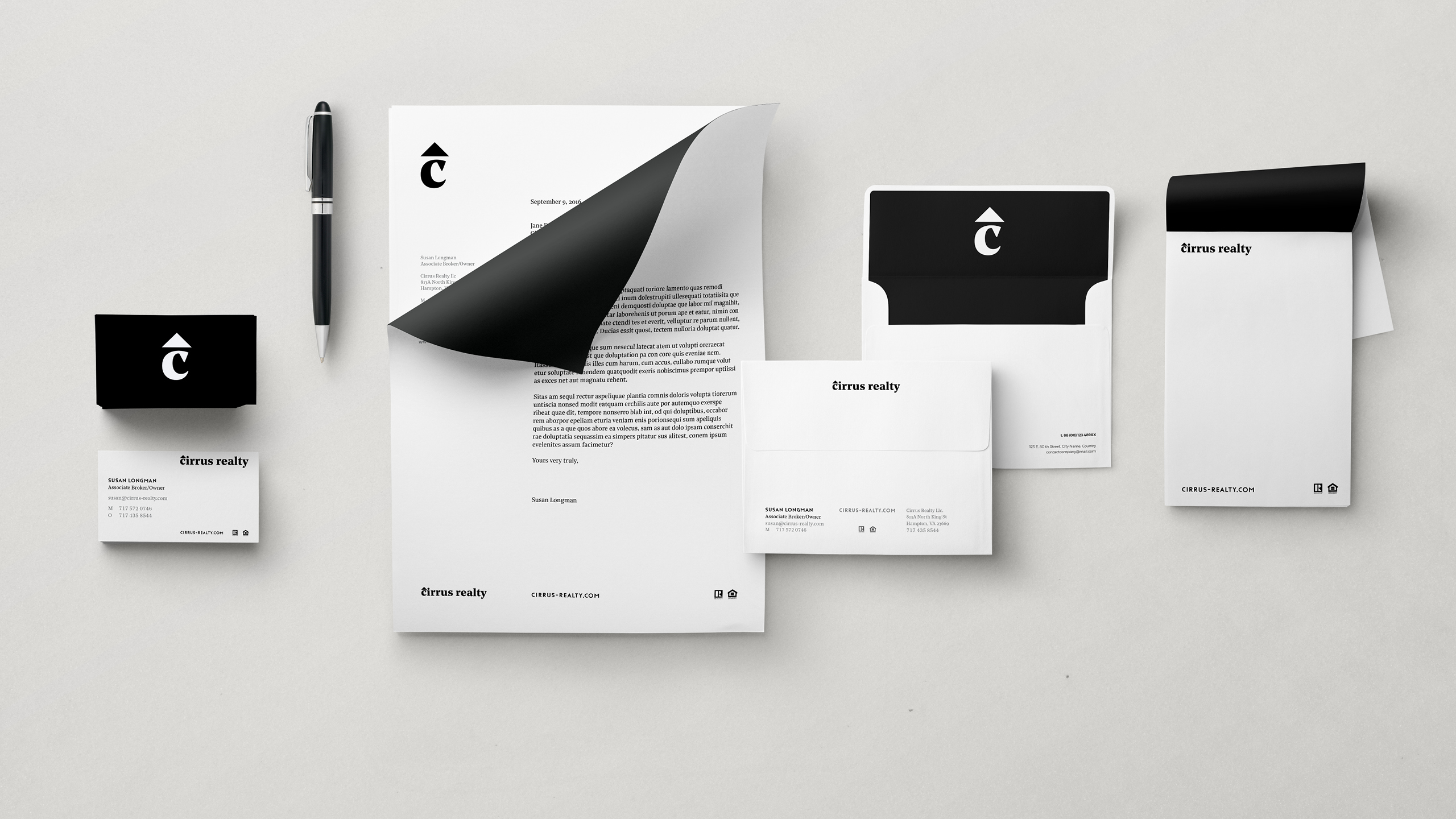
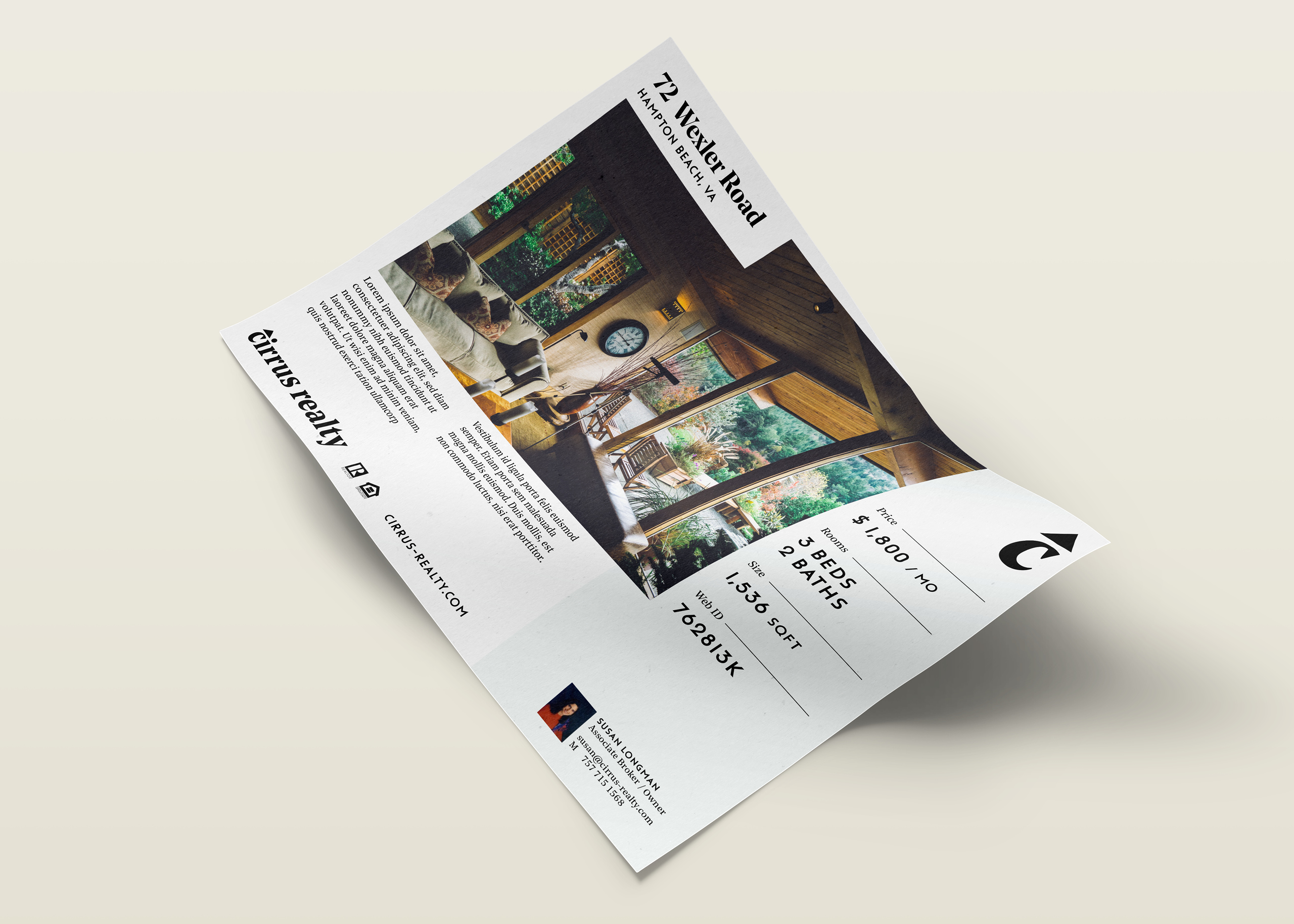
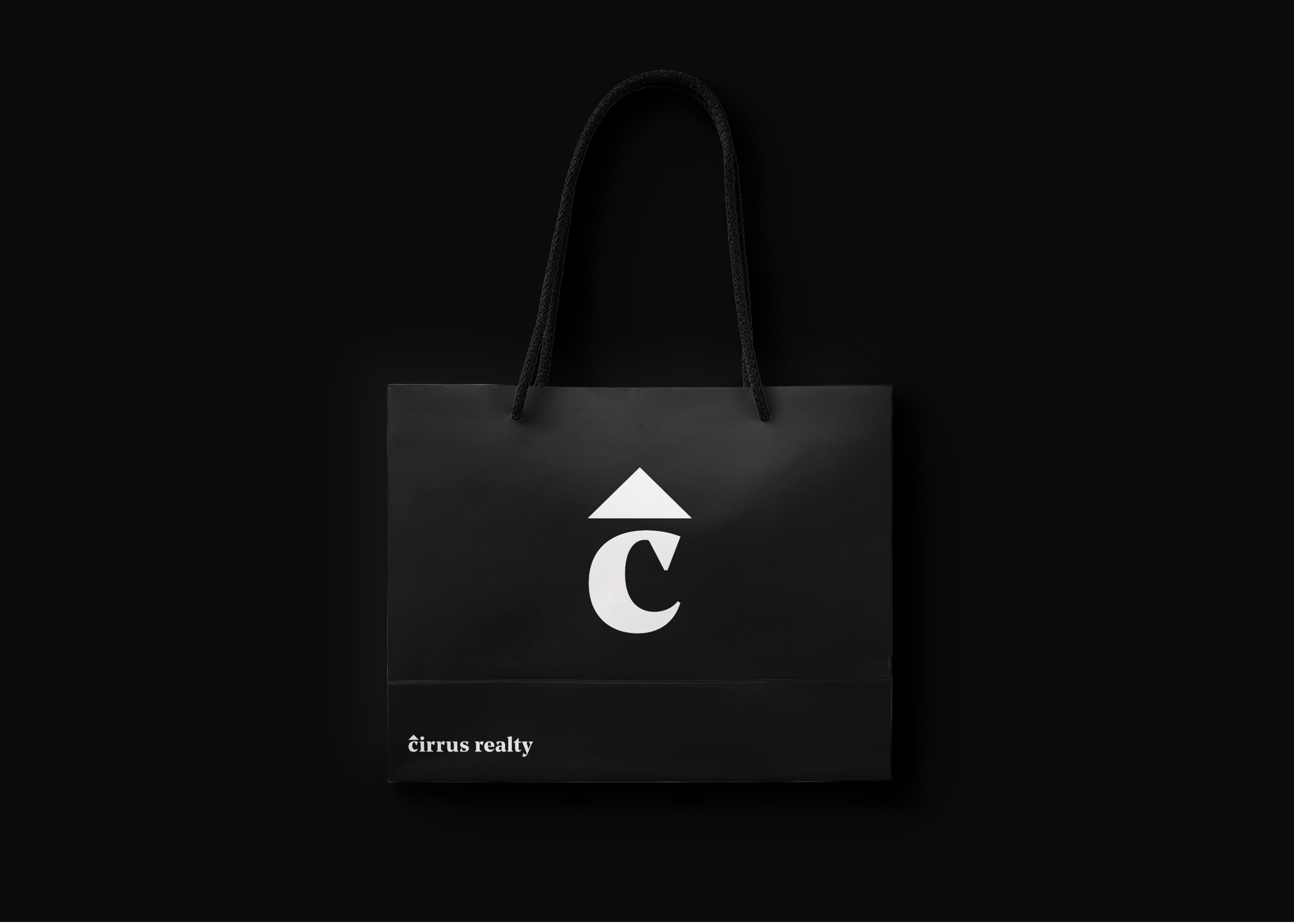
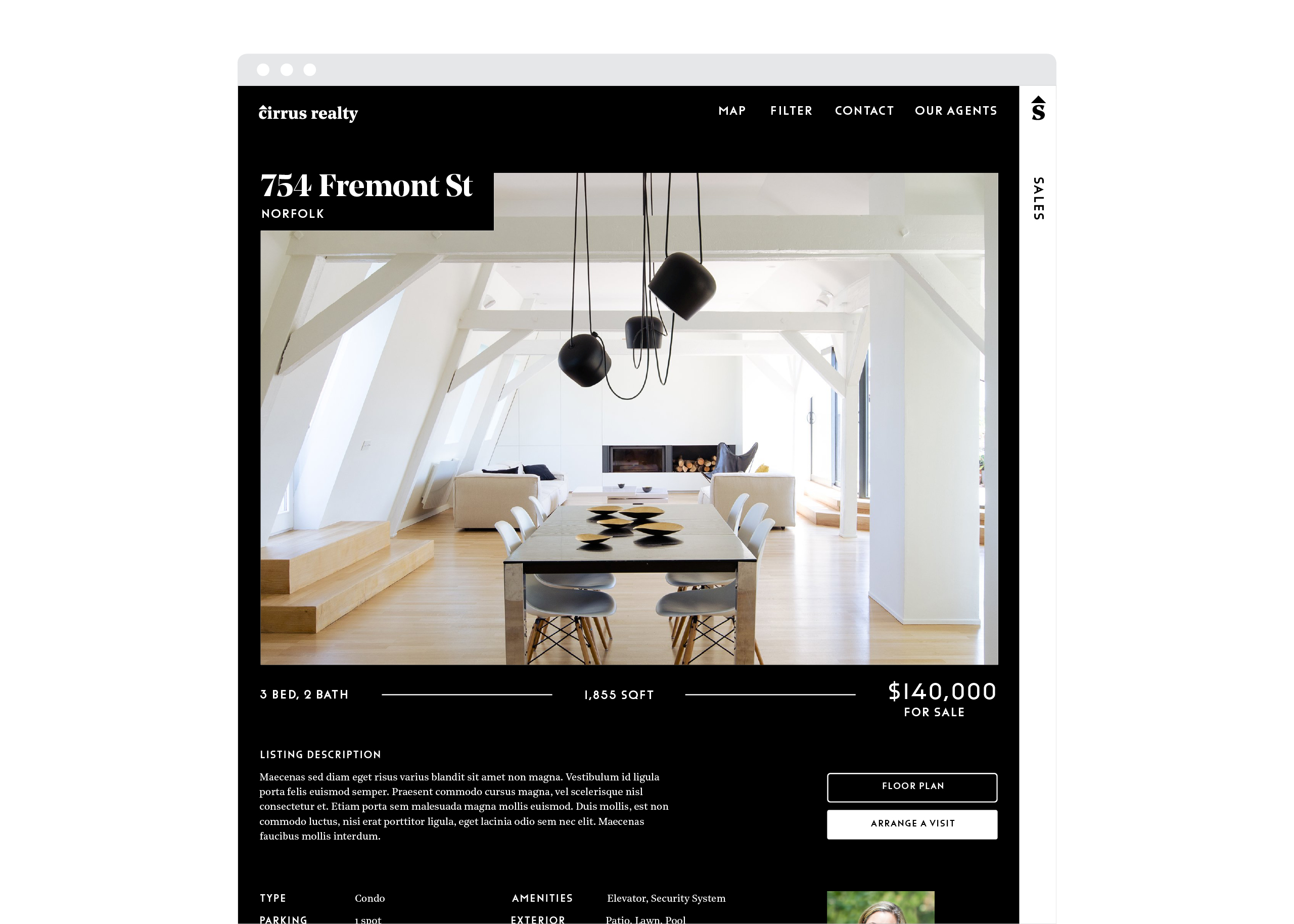
The identities are extremely simple: black and white color scheme, typography-led with the choice of typography being a sharp serif coupled with a very geometric Sans, and paired down use of photography. The two companies have everything in common but one thing: one is always on black, while the other is on white.
The design of the website is a major part of the identity, allowing them to showcase the relationship between the two companies in a simple, understandable way.
Role .................. Designer, Art Director
Client ................ Susan Longman, Johnny Parker
Team .................. Chris Corby (website developer)
Field ................. Brand Identity
Published ............. December 2018
Typefaces ............. Noe Display & Text by Schick Toikka, Funkis by Letters From Sweden
Develop the logo and brand identity for two sister companies operating out Virginia.
Solution
The idea of home has often been distilled down to a roof. By pairing this simple shape with a beautiful wedge serif typeface (Noe Text by Schick Toikka) that contains the same exact graphic gestures (triangular shapes), a sense of unity is created in the logotype.
The identities are extremely simple: black and white color scheme, typography-led with the choice of typography being a sharp serif coupled with a very geometric Sans, and paired down use of photography. The two companies have everything in common but one thing: one is always on black, while the other is on white.
The design of the website is a major part of the identity, allowing them to showcase the relationship between the two companies in a simple, understandable way.
Role .................. Designer, Art Director
Client ................ Susan Longman, Johnny Parker
Team .................. Chris Corby (website developer)
Field ................. Brand Identity
Published ............. December 2018
Typefaces ............. Noe Display & Text by Schick Toikka, Funkis by Letters From Sweden