Bacàn Restaurant Identity & Signage
Bacàn is an Italian restaurant in the heart of Williamsburg, Brooklyn. In January 2024, they reopened their doors with renewed energy, culinary ideas and a restructured interior. Pentagram partner Andrea Trabucco-Campos and team developed a new visual identity and environmental graphics to signal the restaurant's unique Italian roots, while standing apart from the overcrowded NYC landscape of other restaurants in that genre.
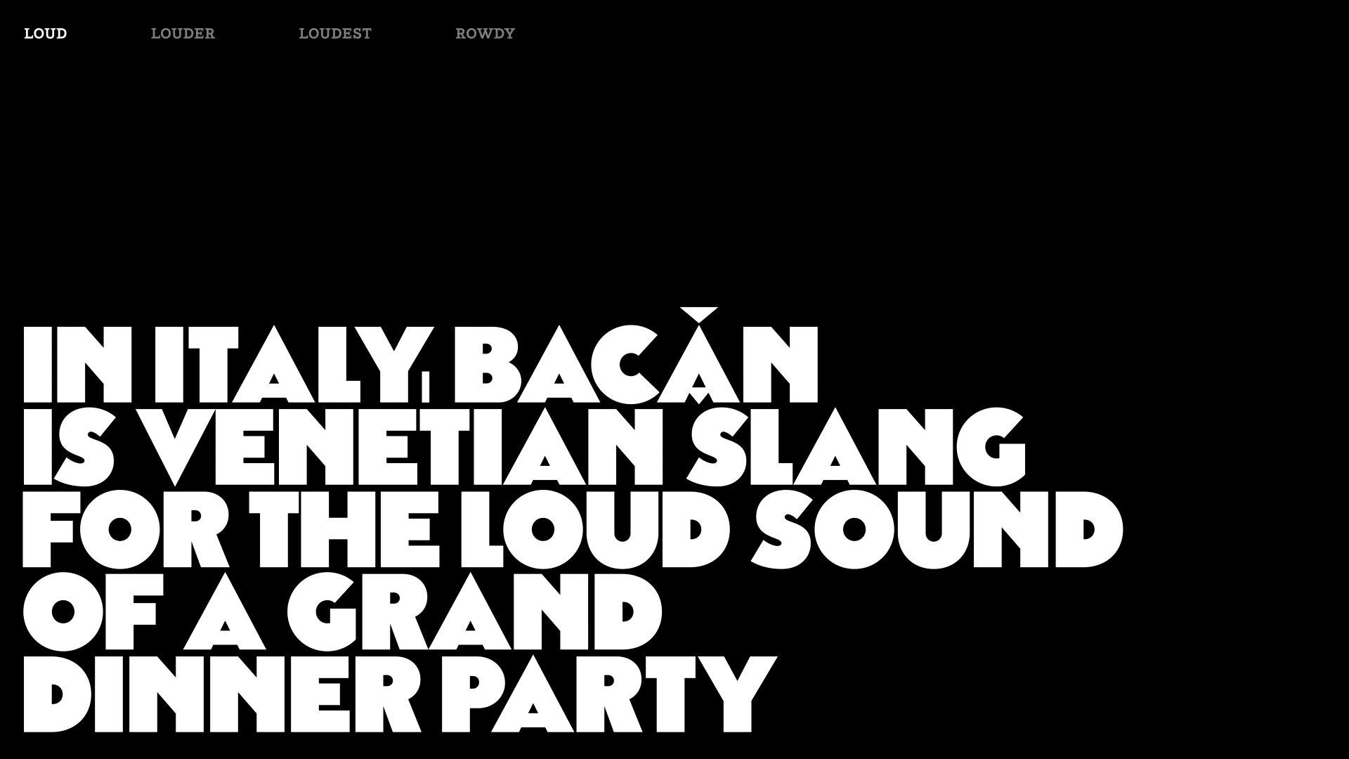
The visual concept simply emerges from the name: in Northern Italy, the word Bacàn stands for the loud sound of a great dinner party. The brand identity uses letterforms as sound waves: expanding, colliding and overlapping—a playful capture of that boisterous energy. The use of black and white, positive and negative, establishes a bold typographic texture that rhymes with early Futurist (with a special nod to Fortunato Depero) and mid-century op-art forms, an unequivocally Italian vernacular.
Done at Pentagram
Role .................. Creative direction & design
Team .................. Monica Losada, JJ Jung, Camila Perez
Photography ........... Àron Filkey
Field ................. Identity, Custom Typography
Typefaces ............. Piek by Optimo, Battling by 205TF, and custom type, Grand Bacàn Sans by moi.
Published ............. May 2024


The brand identity uses letterforms as sound waves: expanding, colliding and overlapping—a playful capture of that boisterous energy.

The custom typeface, Grand Bacàn Sans, is inspired by wood and metal typefaces that permeated the visual language of Italy in the early 1900s, with their combination of pure geometry and heavy weights that achieve an impactful, yet approachable visual tone of voice.
Grand Bacàn Sans is built with three styles embodying different volume levels: from loud to loudest, the typeface changes getting bolder. The styles can be combined to achieve a playful & expressive setting that allows for dynamic typographic compositions.
Grand Bacàn Sans is built with three styles embodying different volume levels: from loud to loudest, the typeface changes getting bolder. The styles can be combined to achieve a playful & expressive setting that allows for dynamic typographic compositions.


The identity fluctuates from states of order to chaos, resembling the experience of a dinner from the moment the food is first served to when the check arrives and the table is coated with plates.
The custom typeface is complemented with Piek by Optimo, a highly legible slab serif with personality that feels both old & new, and Battling by 205TF.
The graphic language is extended into small illustrations that build on the language of overlap, which when expanded to their loudest create abstract compositions that feel like op-art. This tension between communication and abstraction is at the heart of the visual interest for the identity.
