Irvington Theater
Brand Identity
Brief
First opened in 1902, Irvington Theater has become one of the cultural hearts of the Hudson Rivertowns, New York. In 2019 the Theater Commission built new ambitions for their programming. The aim became to showcase the diverse range & wealth of events produced by the Theater and their Arts Partners, revitalize and centralize their brand identity in a way that could be executed by their newly assemble internal team.
Solution
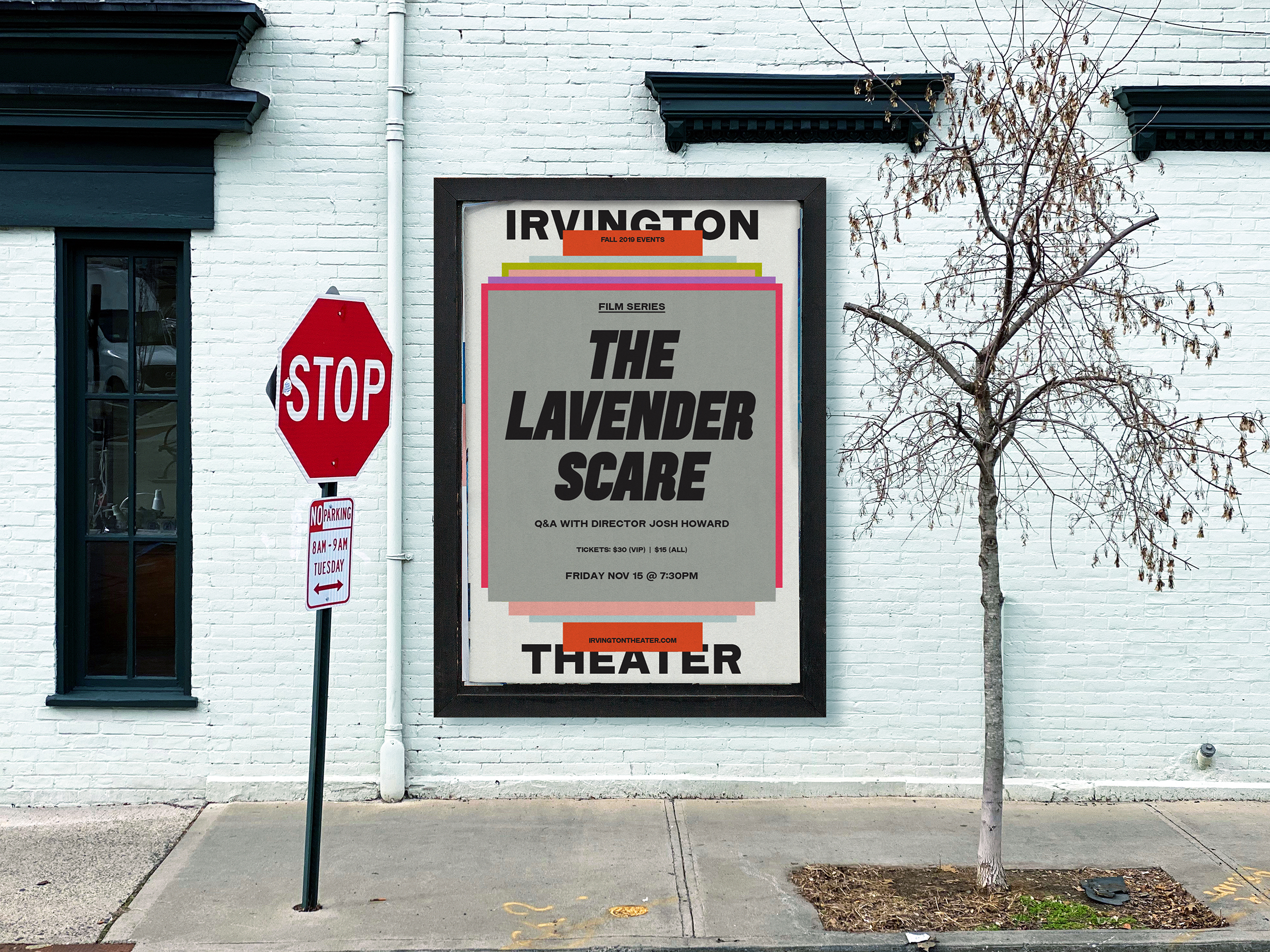
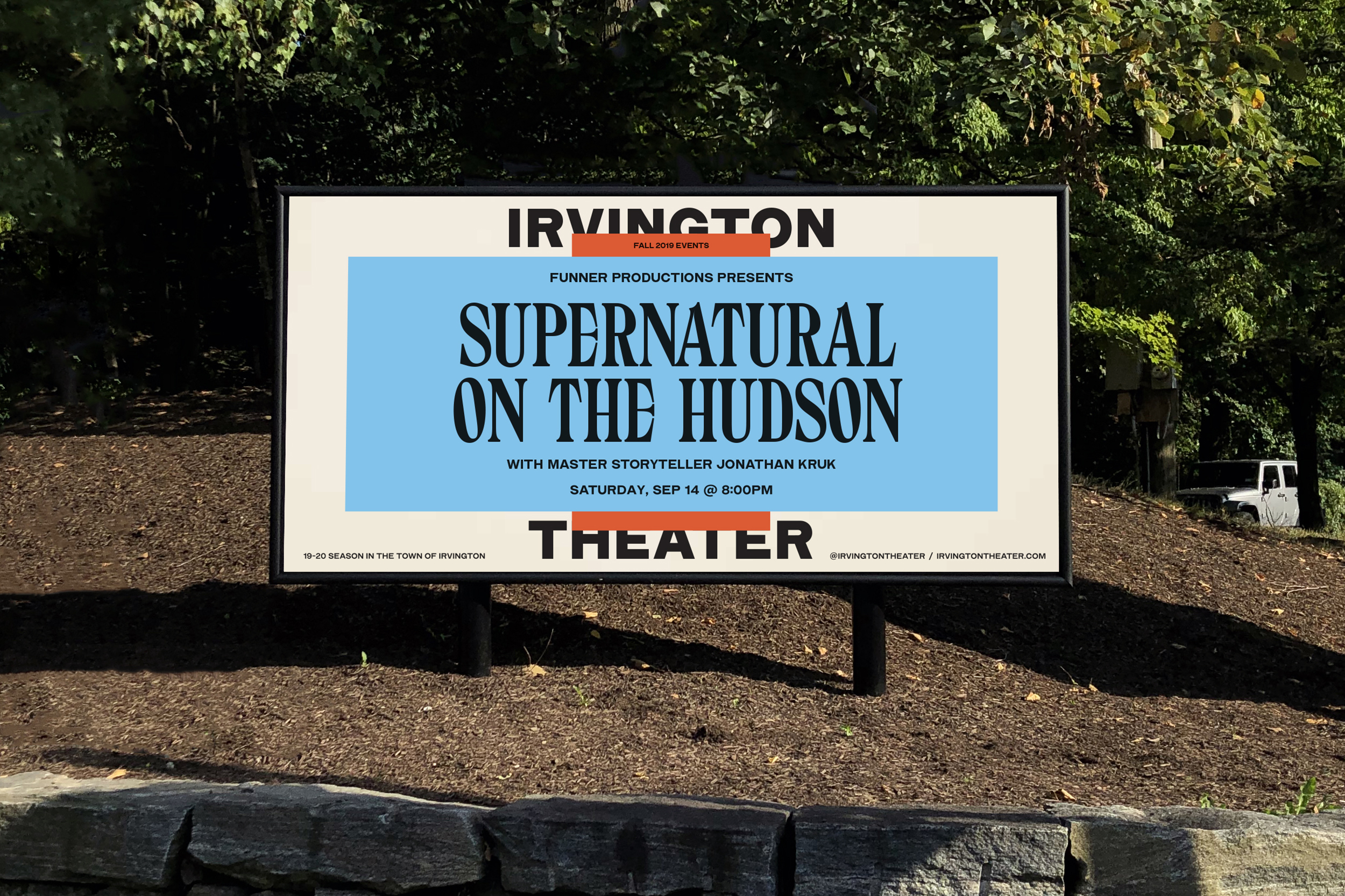
The brand identity is designed to capture the cultural energy flowing through the Theater: inspired by the visual language of old-school advertisement and wheatpaste posters, we created a system based on two main elements—layering and vernacular typography.
Layering is a metaphor of the passage of time, achieved both through stacking & color. The wood-inspired typography captures the vibrance of the varied cultural personalities passing through the Irvington Theater.
Finally, we simplified the naming from Irvington Town Hall Theater to Irvington Theater, which is more direct & memorable.
︎ Designed in partnership with Javier Arizu of Pràctica
Role .................. Design & creative direction
Field ................. Identity, Cultural
Special Thanks ........ Laurie Chock
Typefaces ............. The Pyte Foundry’s 52 amazingly wild Wood typefaces + Irvington Modern Gothic by A.A. Trabucco-Campos
Published ............. October 2019
First opened in 1902, Irvington Theater has become one of the cultural hearts of the Hudson Rivertowns, New York. In 2019 the Theater Commission built new ambitions for their programming. The aim became to showcase the diverse range & wealth of events produced by the Theater and their Arts Partners, revitalize and centralize their brand identity in a way that could be executed by their newly assemble internal team.
Solution
The brand identity is designed to capture the cultural energy flowing through the Theater: inspired by the visual language of old-school advertisement and wheatpaste posters, we created a system based on two main elements—layering and vernacular typography.
Layering is a metaphor of the passage of time, achieved both through stacking & color. The wood-inspired typography captures the vibrance of the varied cultural personalities passing through the Irvington Theater.
Finally, we simplified the naming from Irvington Town Hall Theater to Irvington Theater, which is more direct & memorable.
︎ Designed in partnership with Javier Arizu of Pràctica
Role .................. Design & creative direction
Field ................. Identity, Cultural
Special Thanks ........ Laurie Chock
Typefaces ............. The Pyte Foundry’s 52 amazingly wild Wood typefaces + Irvington Modern Gothic by A.A. Trabucco-Campos
Published ............. October 2019
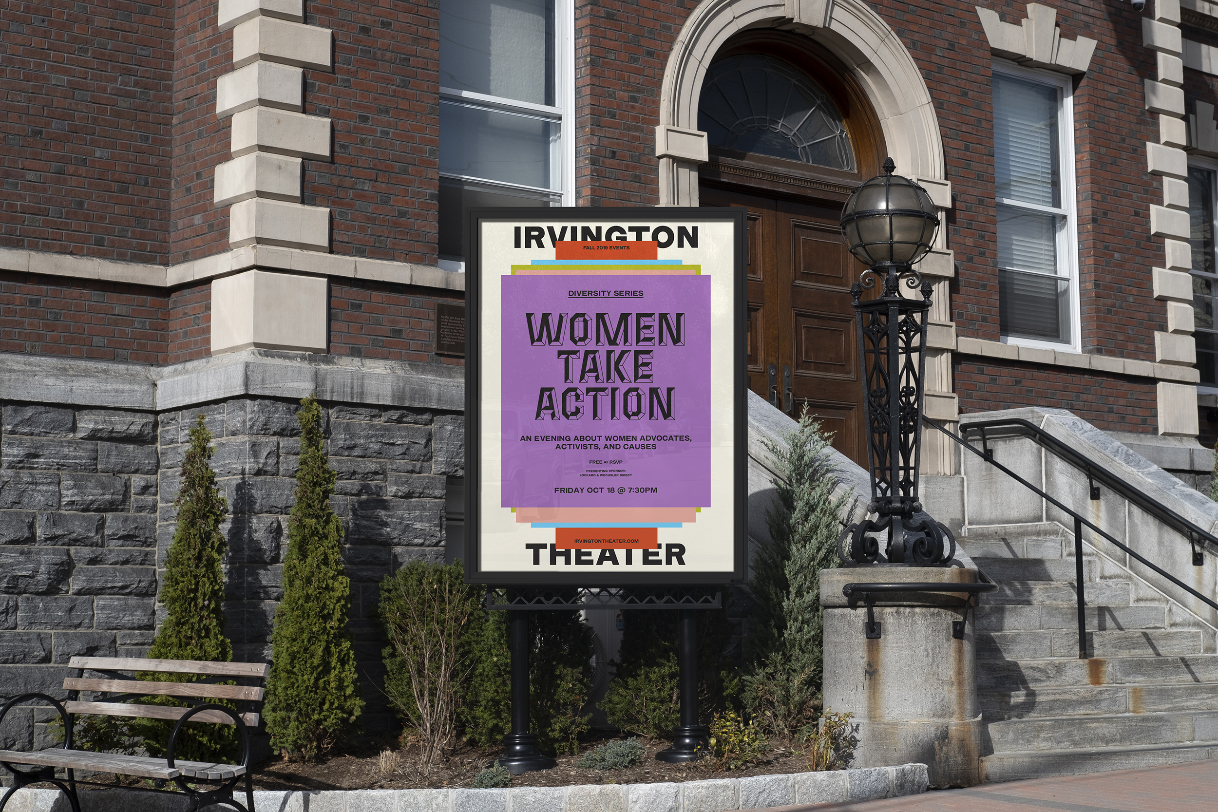

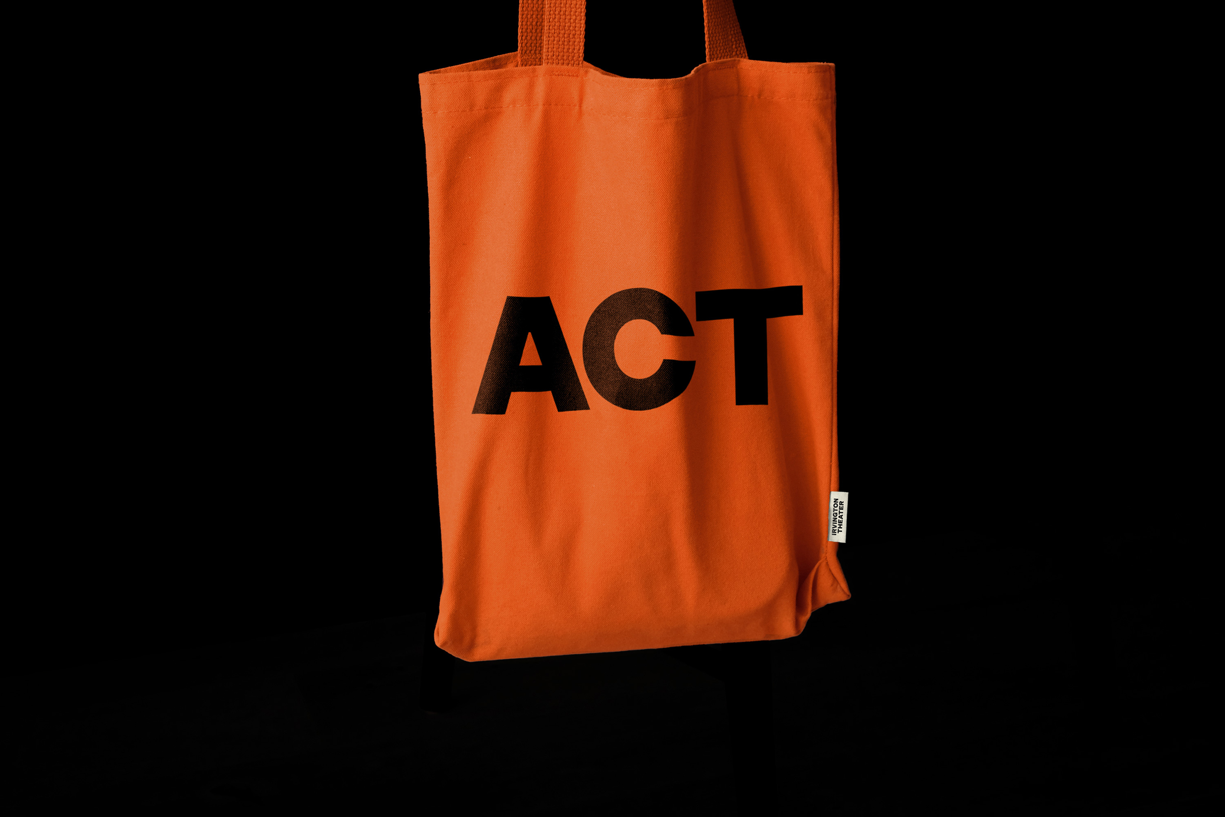
The logo is typeset in a custom-drawn typeface developed for Irvington Theater.
Irvington Modern Gothic is a revival of Modern Gothic, which originated with Barnhart Brothers & Spindler around 1897. It appears to be a modernization of older nineteenth-century gothics, although it has considerable resemblance to the much later European design, Helvetica Bold (1957).
It’s neutral yet solid feel was a perfect complement to the expression of the display wood-inspired typefaces by The Pyte Foundry, which are a nod to the rich history of wheatpaste posters that littered the walls of cities in the Nineteenth century.
![Watercolor by John Orlando Parry, "A London Street Scene" 1835, in the Alfred Dunhill Collection]() Watercolor by John Orlando Parry,"A London Street Scene" 1835, in the Alfred Dunhill Collection
Watercolor by John Orlando Parry,"A London Street Scene" 1835, in the Alfred Dunhill Collection
Irvington Modern Gothic is a revival of Modern Gothic, which originated with Barnhart Brothers & Spindler around 1897. It appears to be a modernization of older nineteenth-century gothics, although it has considerable resemblance to the much later European design, Helvetica Bold (1957).
It’s neutral yet solid feel was a perfect complement to the expression of the display wood-inspired typefaces by The Pyte Foundry, which are a nod to the rich history of wheatpaste posters that littered the walls of cities in the Nineteenth century.
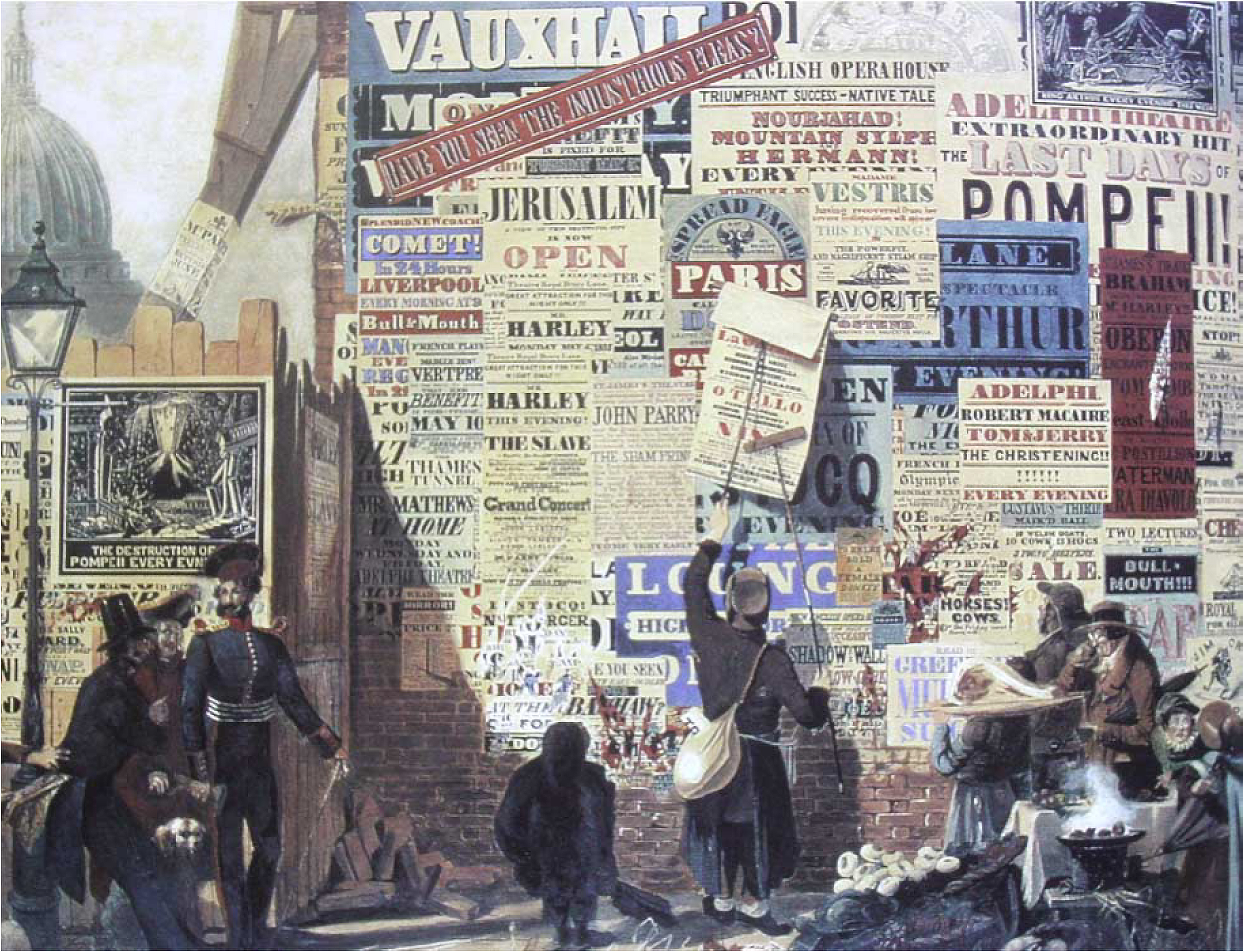 Watercolor by John Orlando Parry,"A London Street Scene" 1835, in the Alfred Dunhill Collection
Ellmer Stefan of The Pyte Foundry drew 52 different typefaces, released one per week for the entire year of 2016. Read more here
“Paying tribute to the typographic diversity and production methods of the Nineteenth century [...]. The aim was not historical accuracy, but rather to revive the spirit of the era following The Industrial Revolution, which is often neglected by the narrative of typographic history.”
From Pyte Legacy, The Pyte Foundry
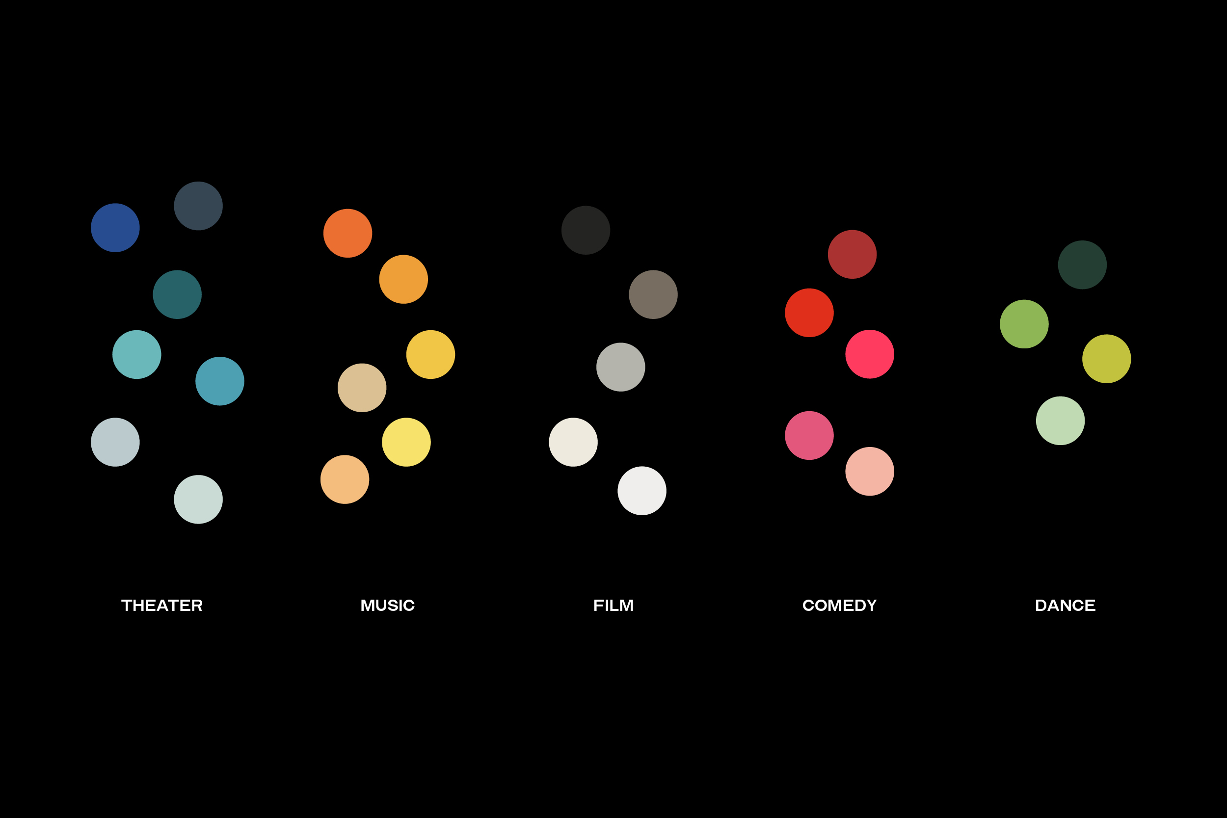
The color palette captures the rich diversity of programming, infusing energy and boldness to the identity.
The always black type on color background is a nod at small town color printers that used affordable color papers with whom Irvington Theater used to print before they went out of business.
The always black type on color background is a nod at small town color printers that used affordable color papers with whom Irvington Theater used to print before they went out of business.


Website
Expected launch Summer 2021.