Glyphs app
Brand Identity & Website
Brief
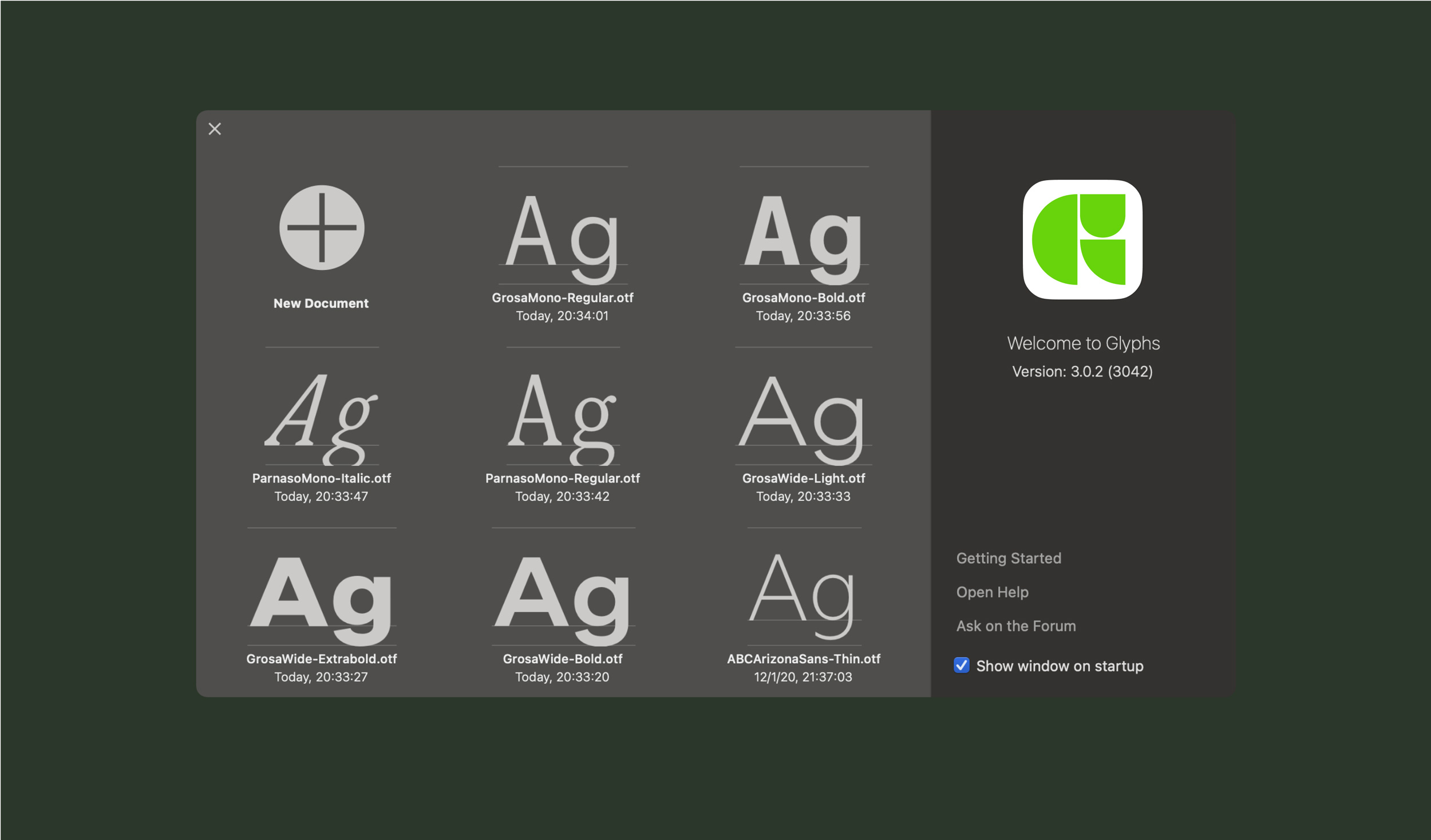
Glyphs App is a Mac font editor and a project of type designers and software developers Georg Seifert and Rainer Erich Scheichelbauer. For the 2020 launch of their highly anticipated Glyphs 3, Georg & Rainer were looking to relaunch their website and brand identity in order to better communicate what Glyphs does and bring new energy to the release.
Solution
The new website centers itself in the community that surrounds Glyphs, simplifying the architecture for ease of navigation, enhancing access to Tutorials and resources and showcasing type designers’ projects in a dynamic way. The website uses a single Variable font by ABC Dinamo, drawn and developed entirely within Glyphs.
The logo and identity simplify and reimagine the app, giving the entirety of the focus on the content itself: the typographic expression made possible with Glyphs.
︎ Designed in partnership with Matteo Bologna of Mucca
︎ Visit the Glyphs website here
Role .................. Design & creative direction
Field ................. Identity, Technology
Typefaces ............. ABC Arizona VF by ABC Dinamo
Development ........... Chris Corby
Special Thanks ........ Georg & Rainer, Fabian & Johannes
Published ............. November 2020
Glyphs App is a Mac font editor and a project of type designers and software developers Georg Seifert and Rainer Erich Scheichelbauer. For the 2020 launch of their highly anticipated Glyphs 3, Georg & Rainer were looking to relaunch their website and brand identity in order to better communicate what Glyphs does and bring new energy to the release.
Solution
The new website centers itself in the community that surrounds Glyphs, simplifying the architecture for ease of navigation, enhancing access to Tutorials and resources and showcasing type designers’ projects in a dynamic way. The website uses a single Variable font by ABC Dinamo, drawn and developed entirely within Glyphs.
The logo and identity simplify and reimagine the app, giving the entirety of the focus on the content itself: the typographic expression made possible with Glyphs.
︎ Designed in partnership with Matteo Bologna of Mucca
︎ Visit the Glyphs website here
Featured in
Brand New
The Brand Identity
Mindsparkle HttpsterRole .................. Design & creative direction
Field ................. Identity, Technology
Typefaces ............. ABC Arizona VF by ABC Dinamo
Development ........... Chris Corby
Special Thanks ........ Georg & Rainer, Fabian & Johannes
Published ............. November 2020


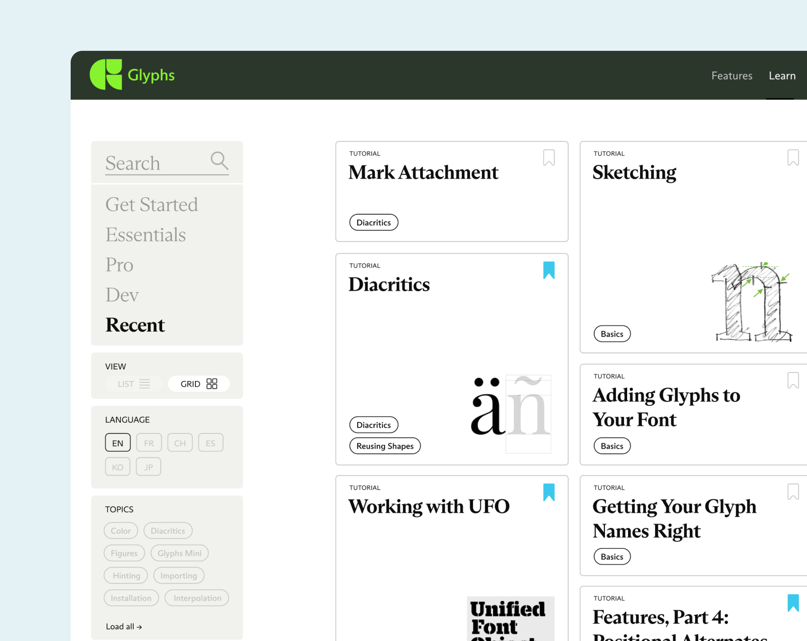
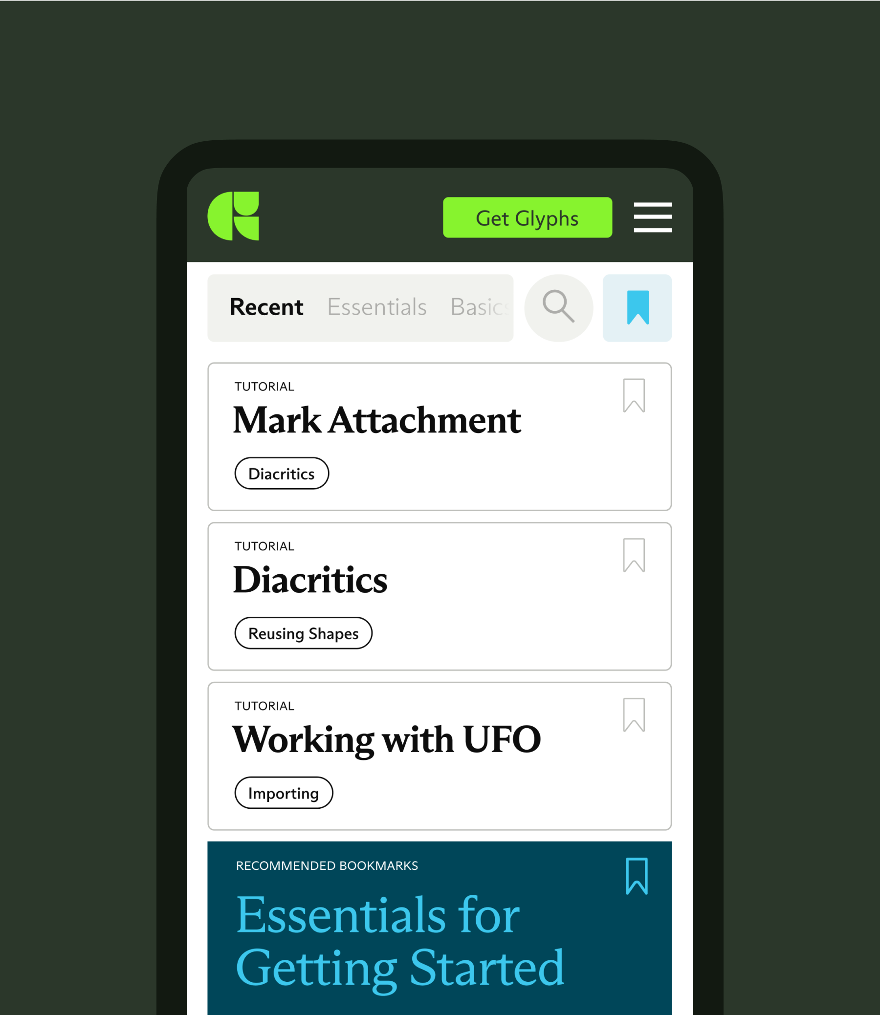
A tool for the community
Glyphs is one of the go-to tools for type design. This is largely because it’s built for everyone: easy to use for Novices and Professional type designers alike. The website is re-imagined as a tool for the community, to give a window to the community’s work, not as just a showcase of an app.
The community superpowers Glyphs by constantly engaging with Tutorials as a resource for learning, the Forum as a form of exchange with the makers of the app and other members. Some of the world’s most renowned foundries use it, and emerging talent is engaging with it on a weekly basis.
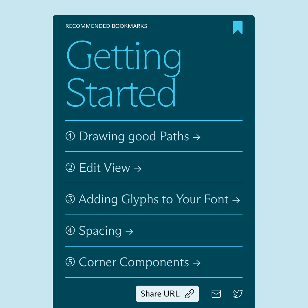
Finding and discovering new tutorials quickly is at the core of the new experience. The Learn section deploys Bookmarks for creating personal lists and recommendations from top talent in the field on topics ranging from essentials to coding of typefaces.

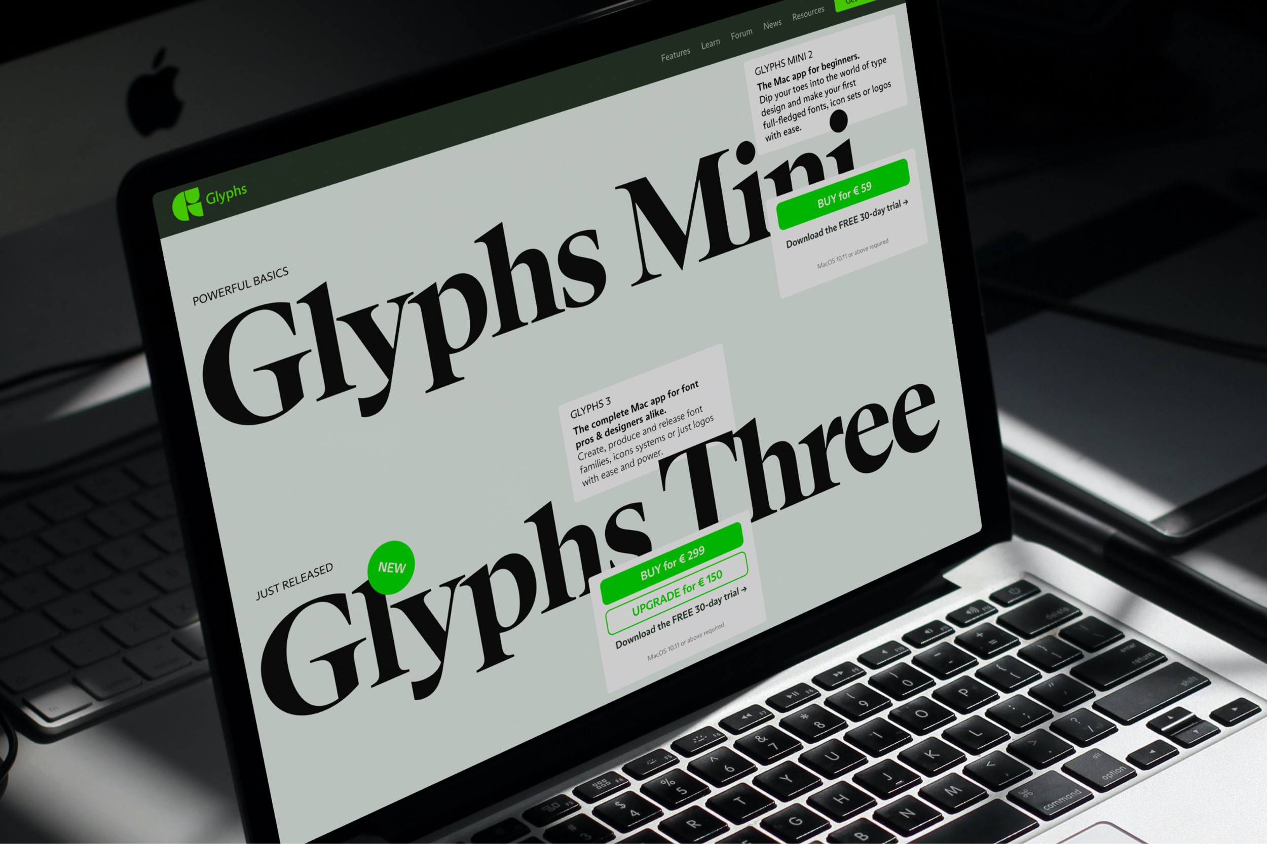
One font can do it all
The website is typeset using ABC Arizona, an unreleased Variable font drawn by Elias Hanzer for ABC Dinamo made entirely within Glyphs. The typeface covers a wide typographic range that spans from Sans to Serif, making versatile for any context.
The range is useful for drawing a reader’s attention through weight shifts, creating hierarchy across content blocks, typesetting long articles for optimal readability and creating visually impactful typographic moments.

Clarity of app features
As part of the work on the identity, we designed and art directed abstractions of the Glyphs app environment. This served as a solid foundation for the talented Abel Martins to explore as illustrations in motion—a new form of community engagement for Glyphs.
A new chapter
The new logo and design system signal a new chapter for Glyphs. The iconic, simplified symbol connects with the modular language at play in the rest of the identity.
The modular language of Glyphs 3 symbol is extended to make the rest of the app suite cohesive: Glyphs 3 Mini and all of the Pro font tools use the same building blocks as the main logo, and will be gradually released in 2021.
The color palette builds on the heritage green that distinguished Glyphs from its competitors, evolving it to a more vibrant, dynamic and ownable green. The extended palette uses a combination of brights and darks that bestow flexibility within the site and social.