Raaka’s Brand Identity & Packaging
Brief
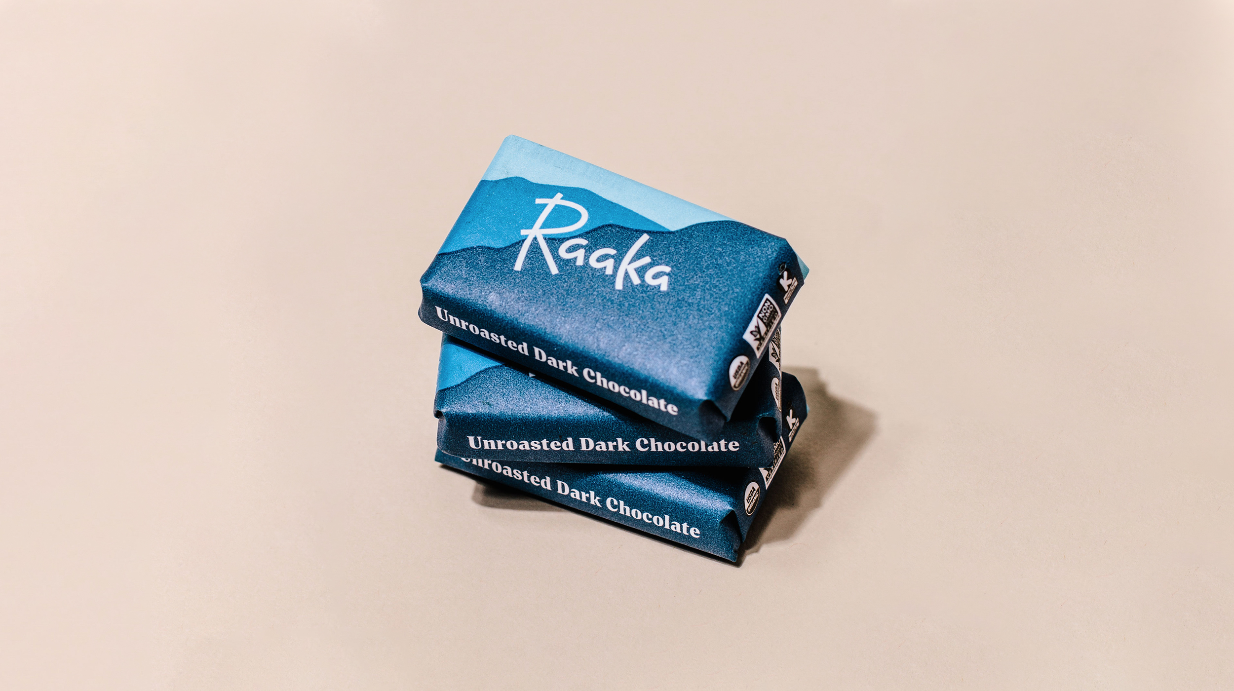
Since 2010, Raaka has been crafting bold and innovative chocolate out of their factory in Red Hook, Brooklyn. By using an unroasted process, they are able to stay true to their cacao’s vibrant, fruity flavors—which are sourced from single-origin growers across the world.
They were looking to redesign their entire packaging line and build a new brand identity.
︎ Designed in partnership with Simon Blockley
Solution
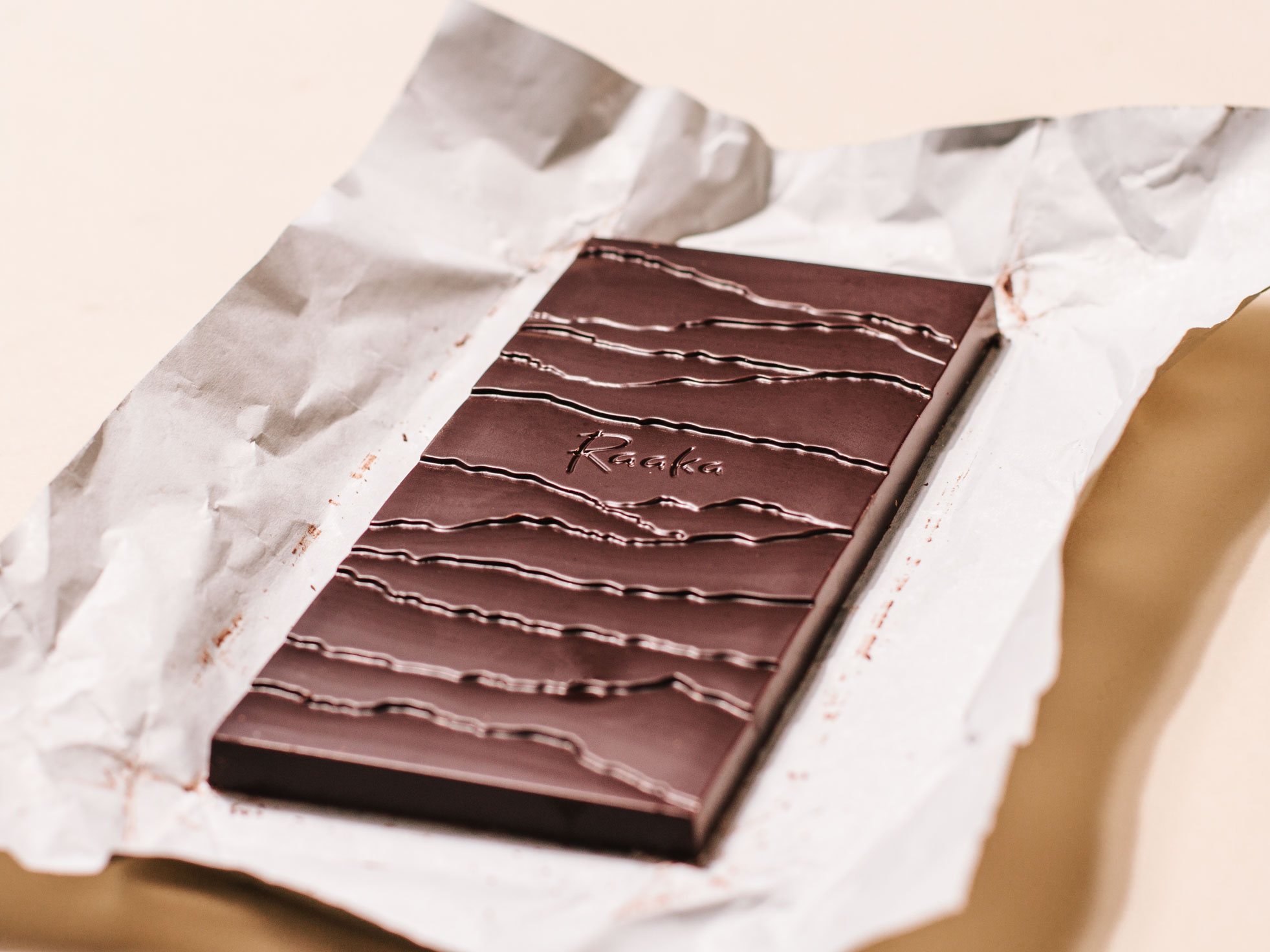
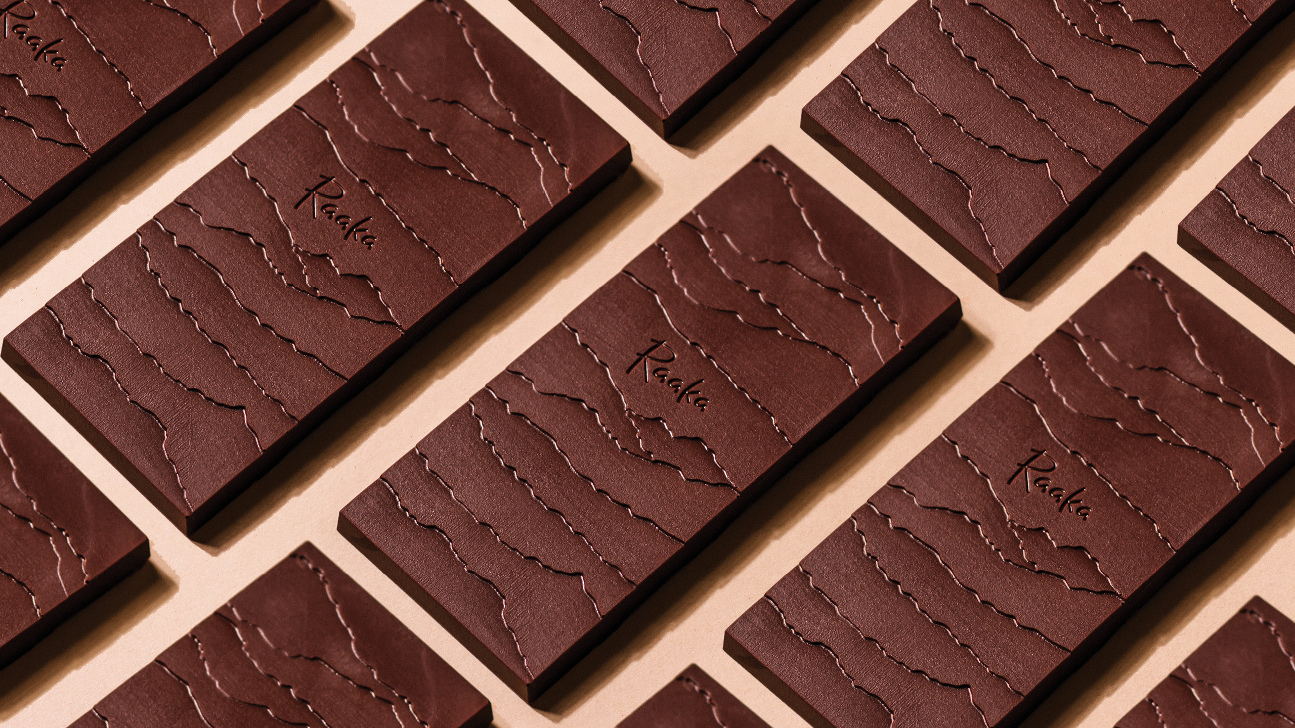
Taking influence from the tasting experience of Raaka’s chocolate, the rebrand establishes a world of intrigue and discovery with flavorful colors, origin-inspired landscapes and a new custom typeface.
A huge thanks to Ryan Cheney, William Mullan, Nate Hodge and the whole Raaka team for their exceptional partnership.
Role .................. Creative direction & design in partnership with Simon Blockley
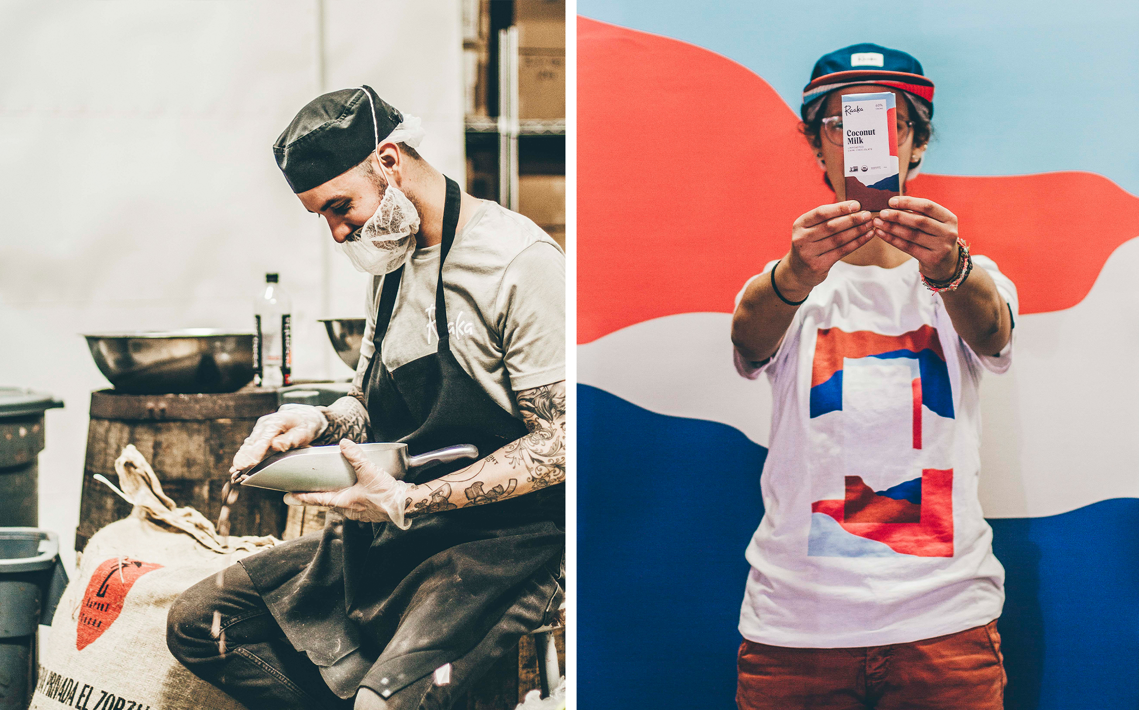
Photography ........... William Mullan
Field ................. Identity, Packaging
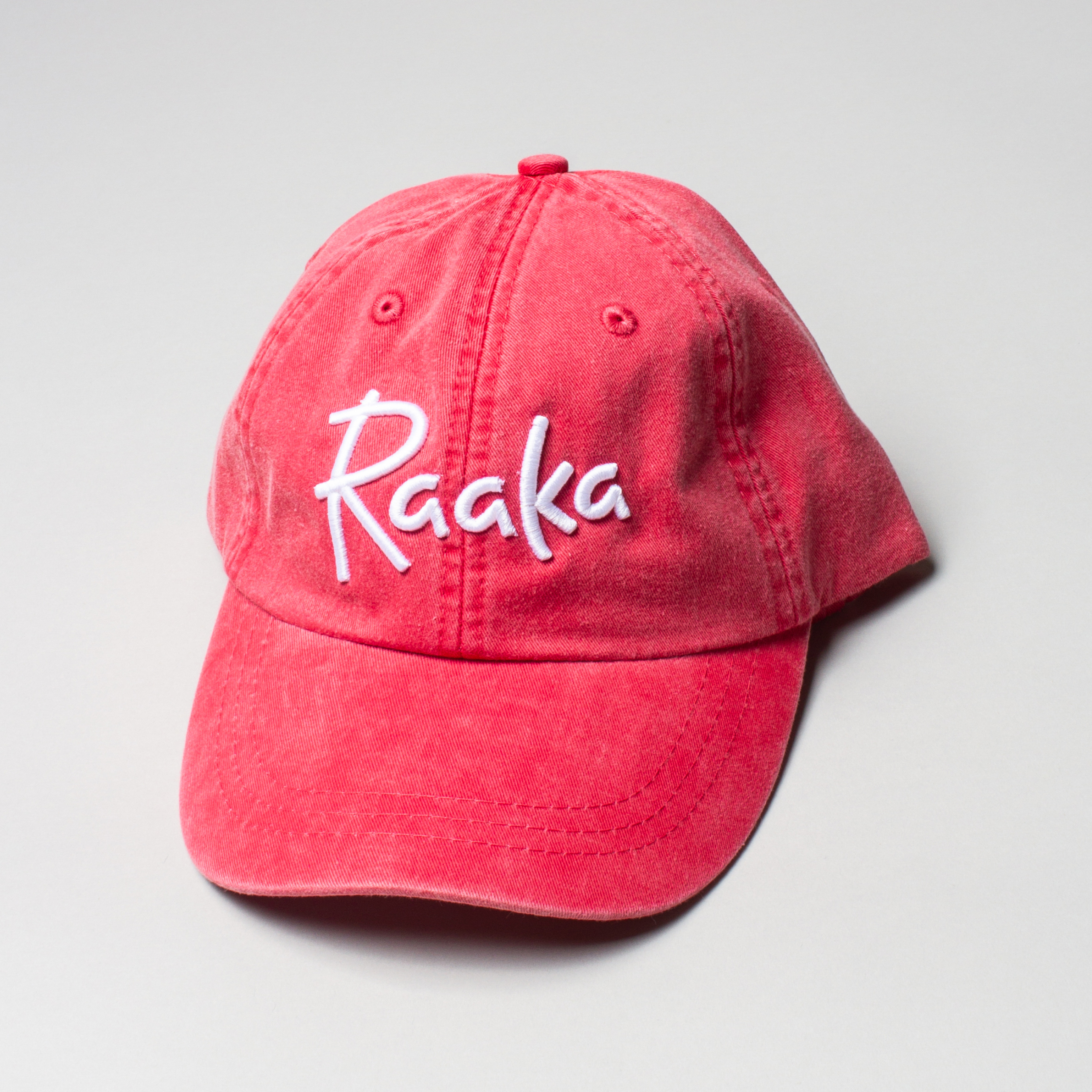
Typefaces ............. Sul Sans by R-Typography, Origin Sans Condensed by Production Type, Alku by me
Published ............. October 2018
Since 2010, Raaka has been crafting bold and innovative chocolate out of their factory in Red Hook, Brooklyn. By using an unroasted process, they are able to stay true to their cacao’s vibrant, fruity flavors—which are sourced from single-origin growers across the world.
They were looking to redesign their entire packaging line and build a new brand identity.
︎ Designed in partnership with Simon Blockley
Solution
Taking influence from the tasting experience of Raaka’s chocolate, the rebrand establishes a world of intrigue and discovery with flavorful colors, origin-inspired landscapes and a new custom typeface.
A huge thanks to Ryan Cheney, William Mullan, Nate Hodge and the whole Raaka team for their exceptional partnership.
Role .................. Creative direction & design in partnership with Simon Blockley
Photography ........... William Mullan
Field ................. Identity, Packaging
Typefaces ............. Sul Sans by R-Typography, Origin Sans Condensed by Production Type, Alku by me
Published ............. October 2018


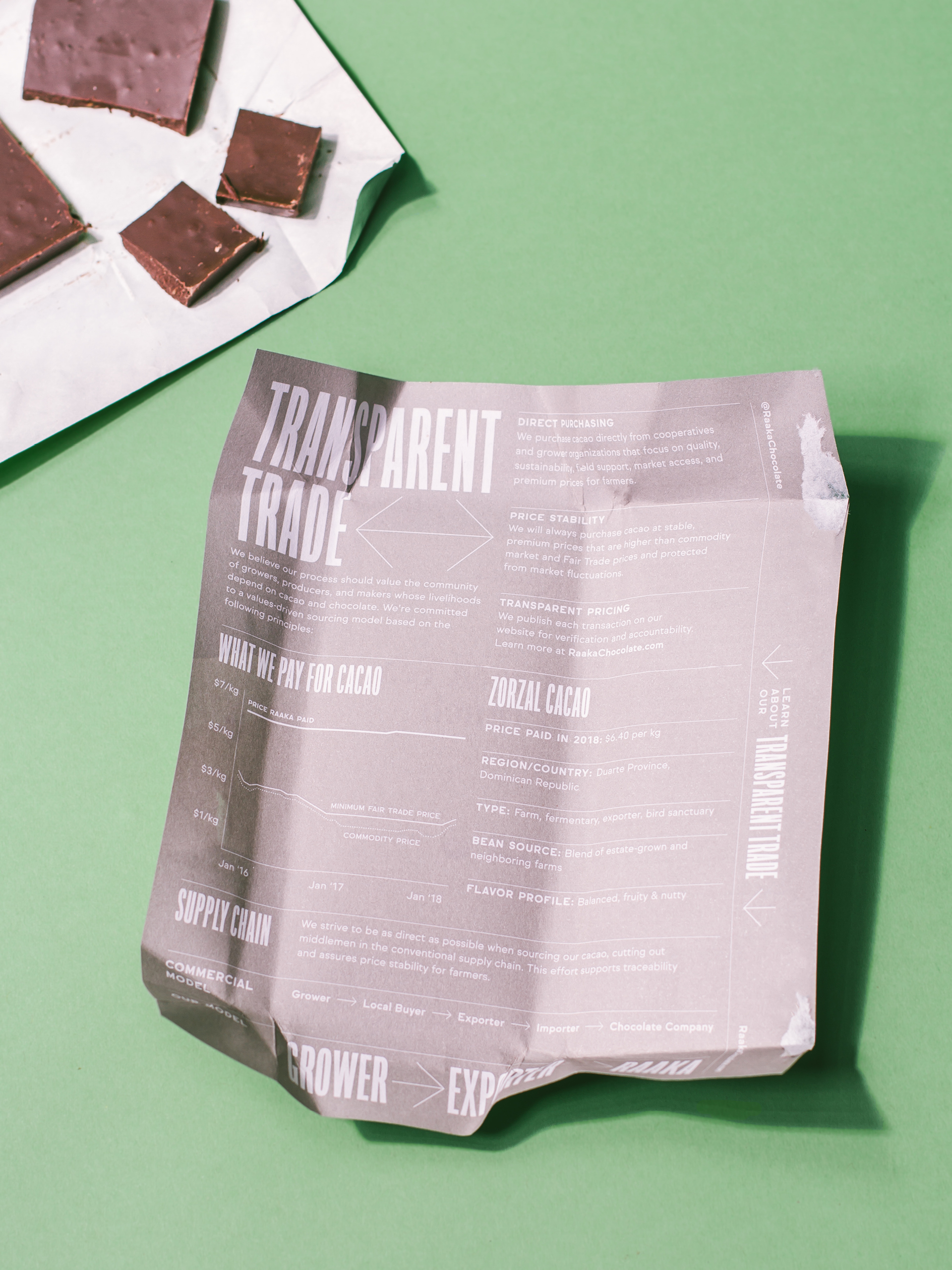
We started from a strategic consideration: elevating the most important aspect of Raaka’s chocolate—their uncommon and vibrant flavors.
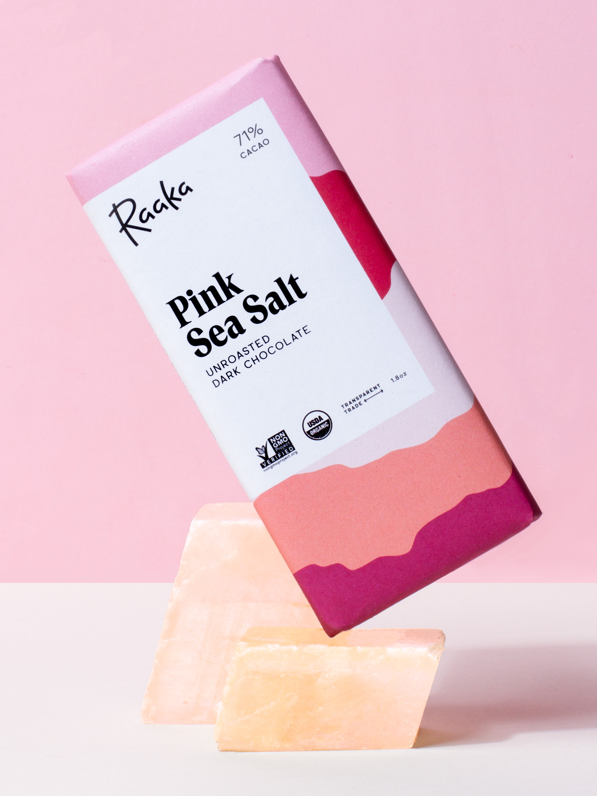
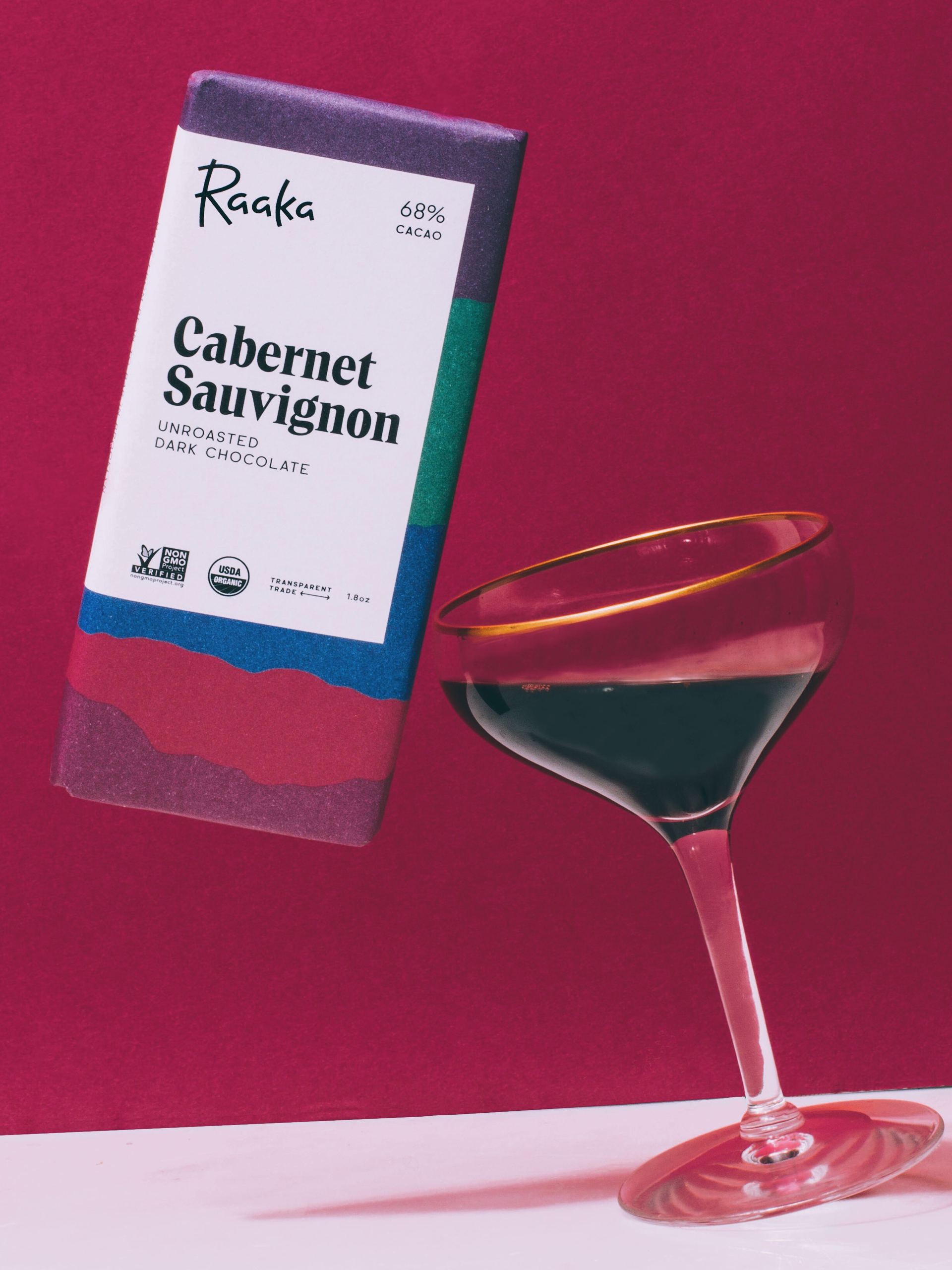
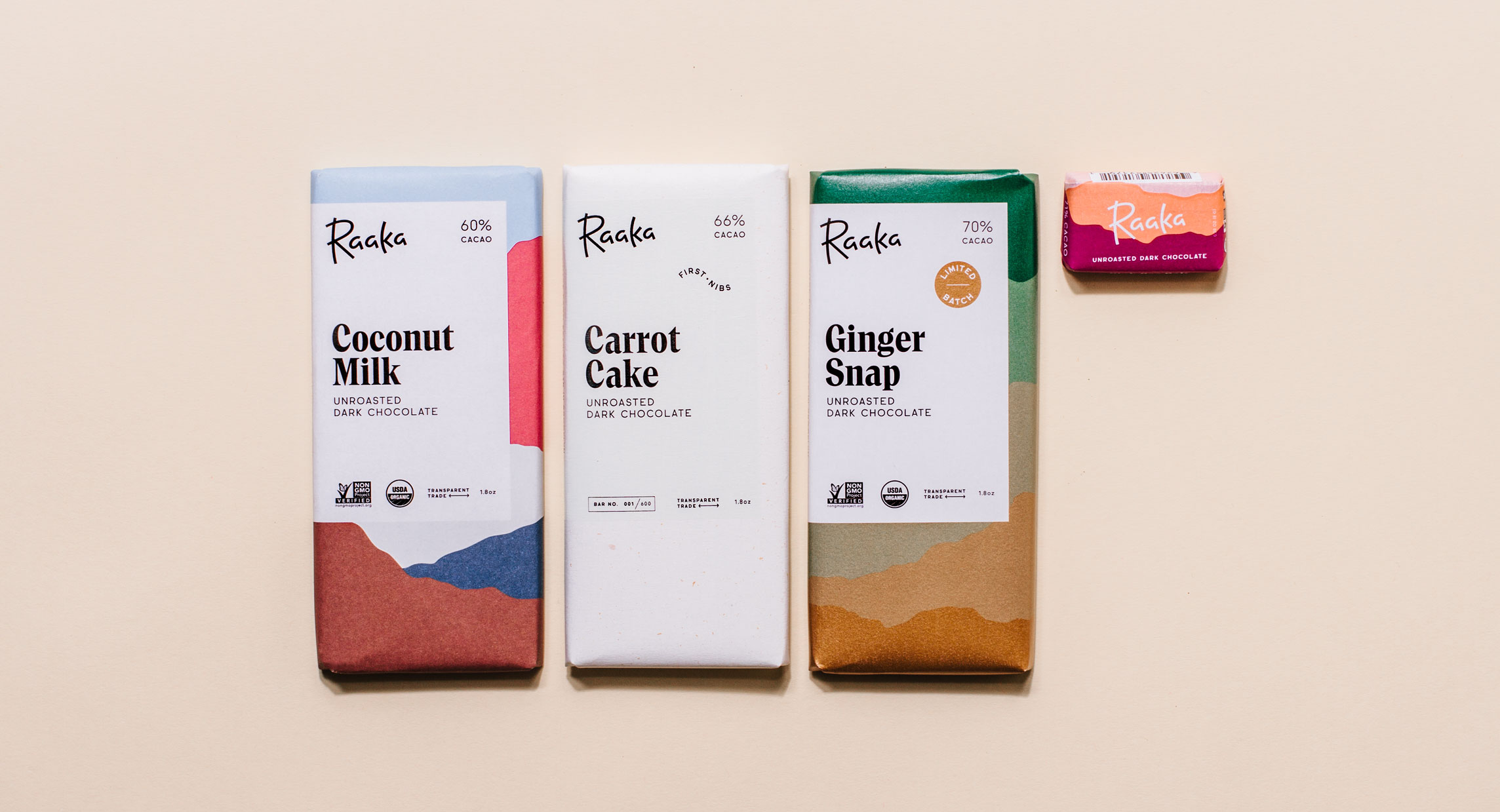
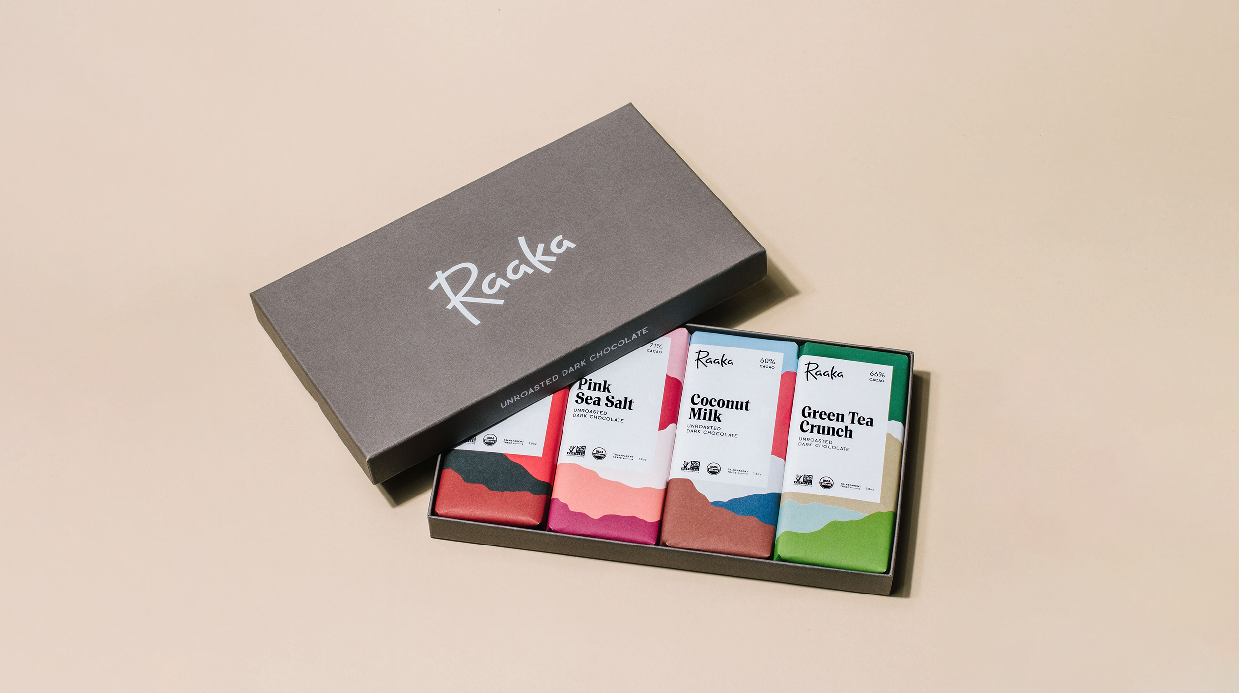
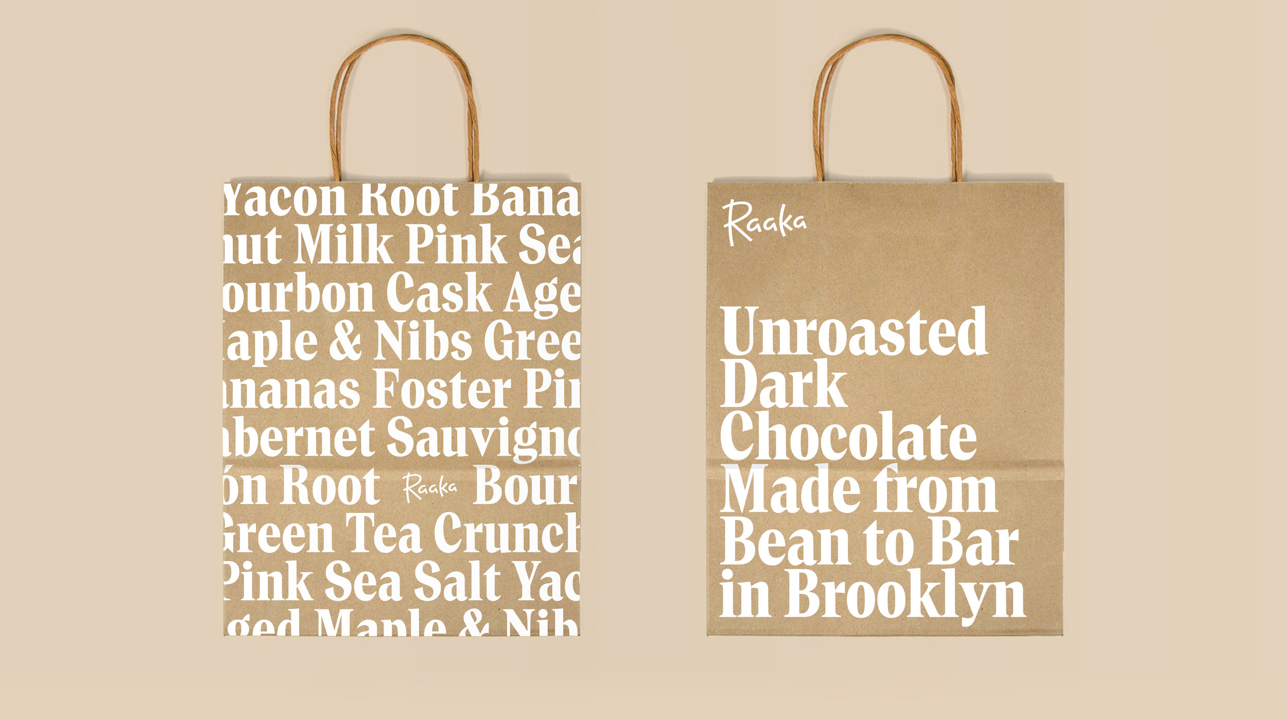
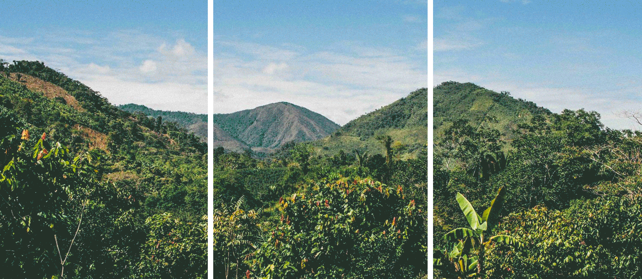
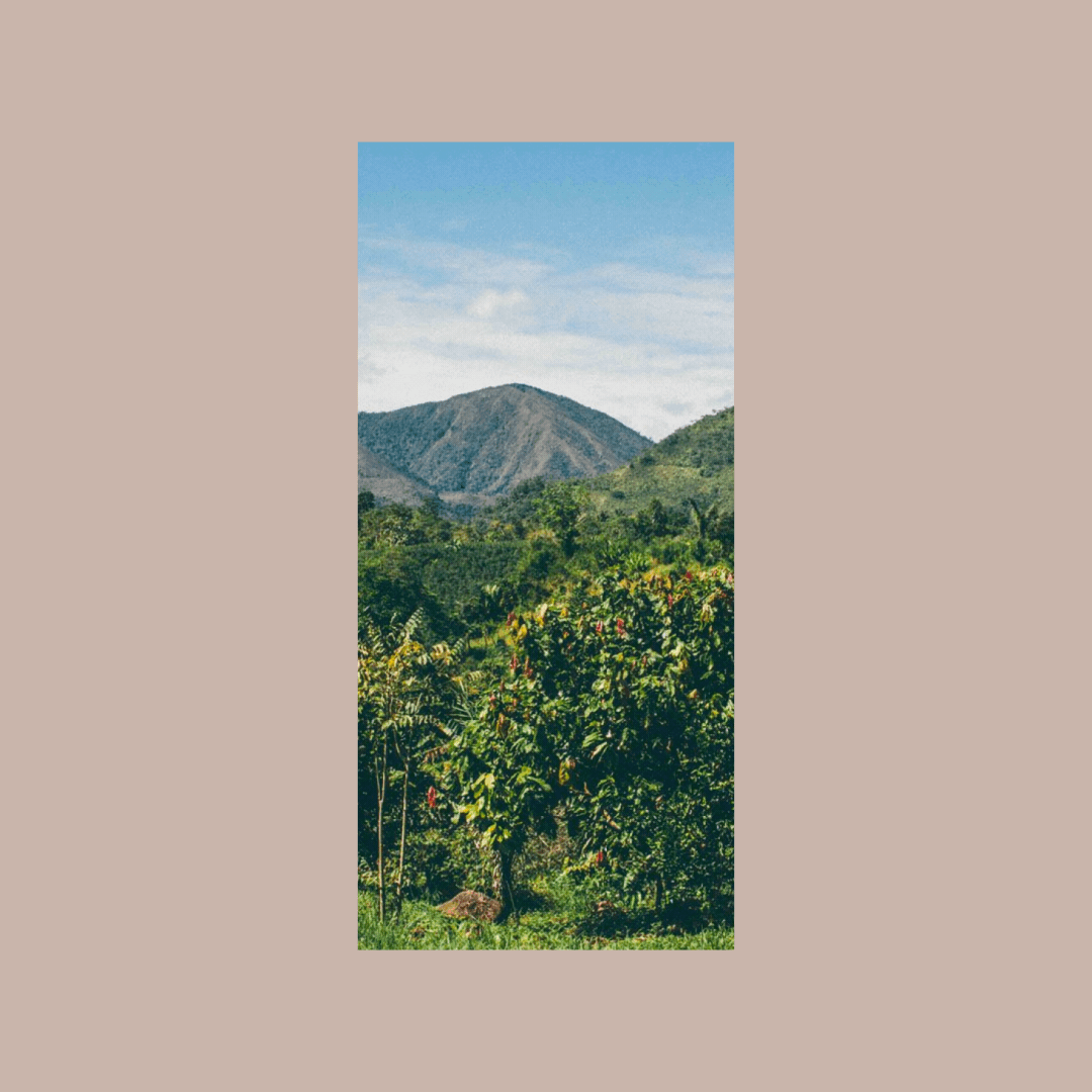
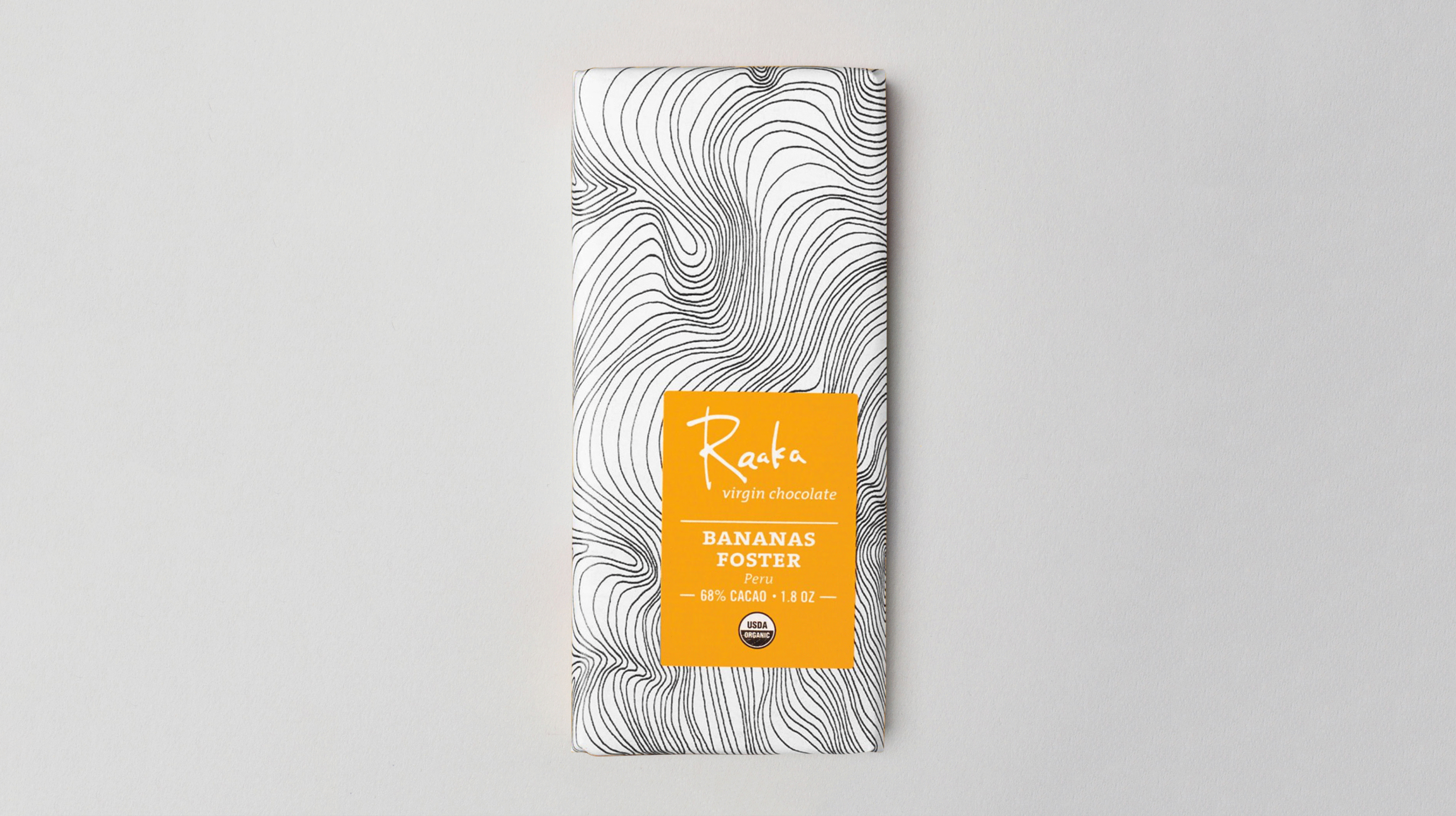
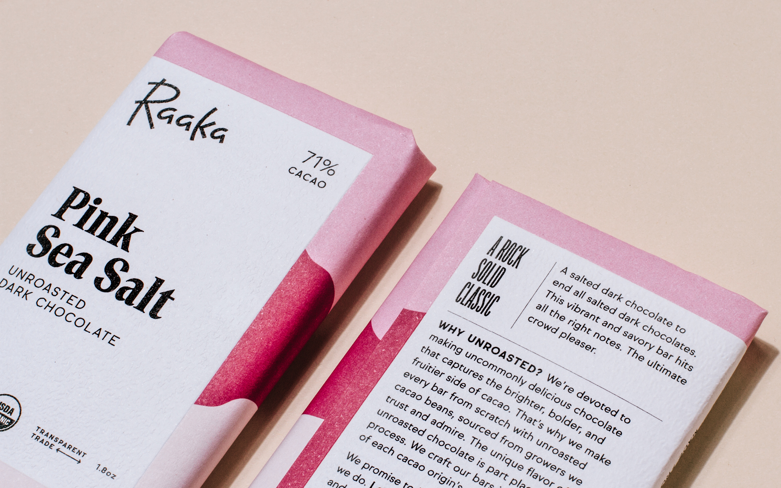
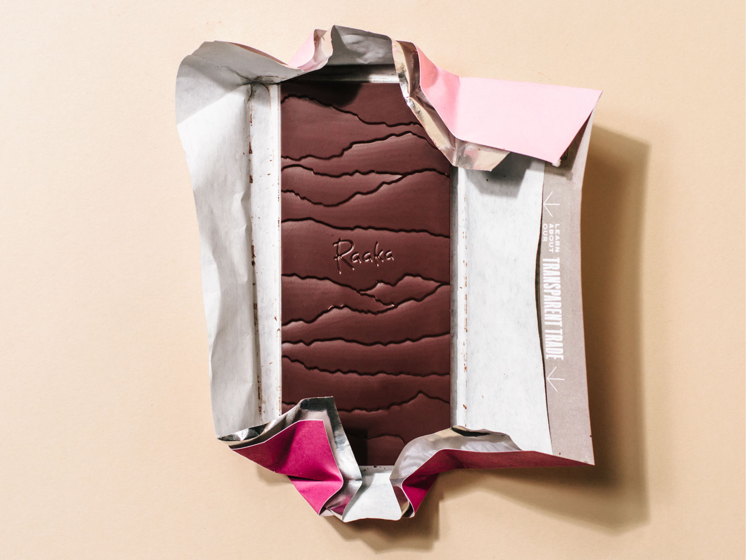
Raaka sources their single origin cacao from growers across the world—using photography from these locations, we created abstract backgrounds that leverage color to embody the flavor profiles of each bar.
Raaka sources their single origin cacao from growers across the world—using photography from these locations, we created abstract backgrounds that leverage color to embody the flavor profiles of each bar.

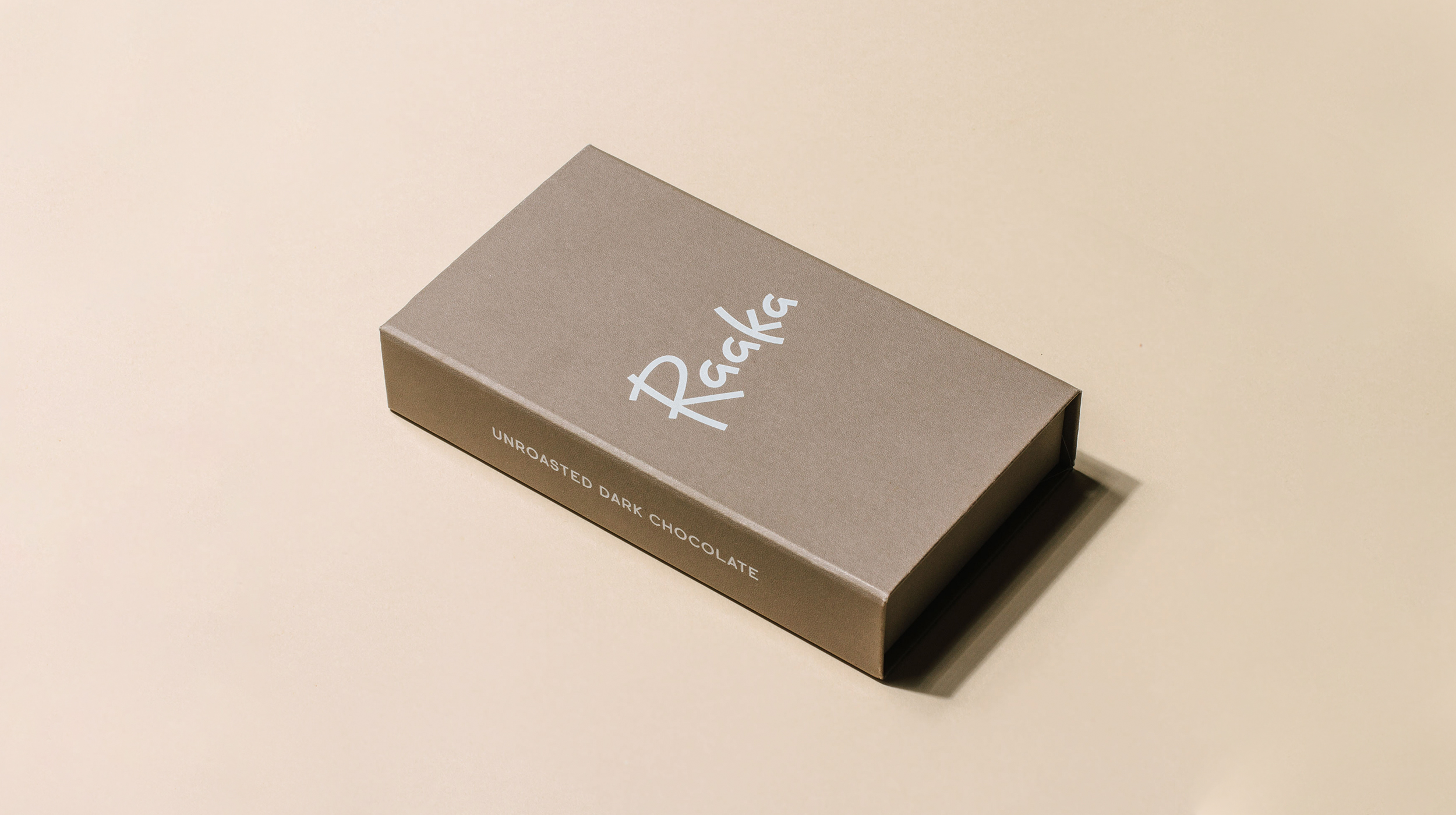
Early in the project we found issues with Raaka’s current label placement—often being obstructed by shelf displays. While maintaining an asymmetrical structure, we repositioned the label for better on-shelf impact.
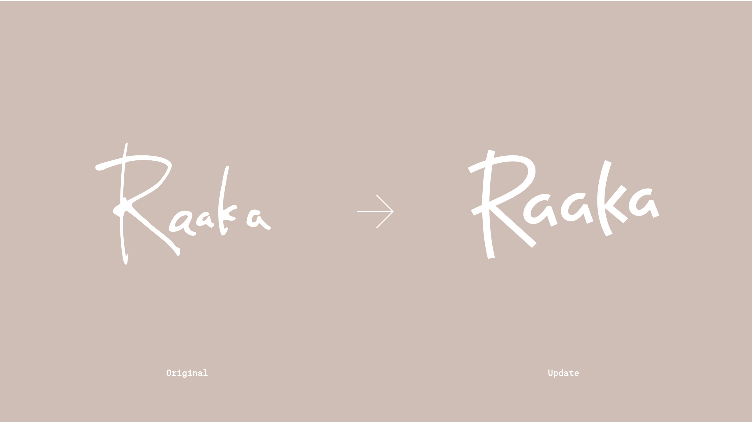
Custom Typeface
Designed a display typeface to be used at medium sizes for the titles of each bar. Simon and I felt a serif typeface could give the front of the bar the warmth it needed.
A long time ago, I had fallen in love with the lowercase “a” that I found on the cover of a book I collected by Stephen Rogers Peck. The typeface was Trooper Roman, which prompted me to look deeper into the genre with classics like Tom’s Roman, Times Modern and Perpetua Super. They share a heritage of editorial use, maintaining an elegant tone.
Alku, Raaka’s new custom typeface, is an interpretation of this rich typographic genre for Raaka: starting from the lowercase “a” I loved, all the other shapes are harmonized with it. Alku is more condensed, with lowered contrast, optimized for setting the titles of each bar.